CUSTOM TYPOGRAPHY
& TYPE TREATMENT
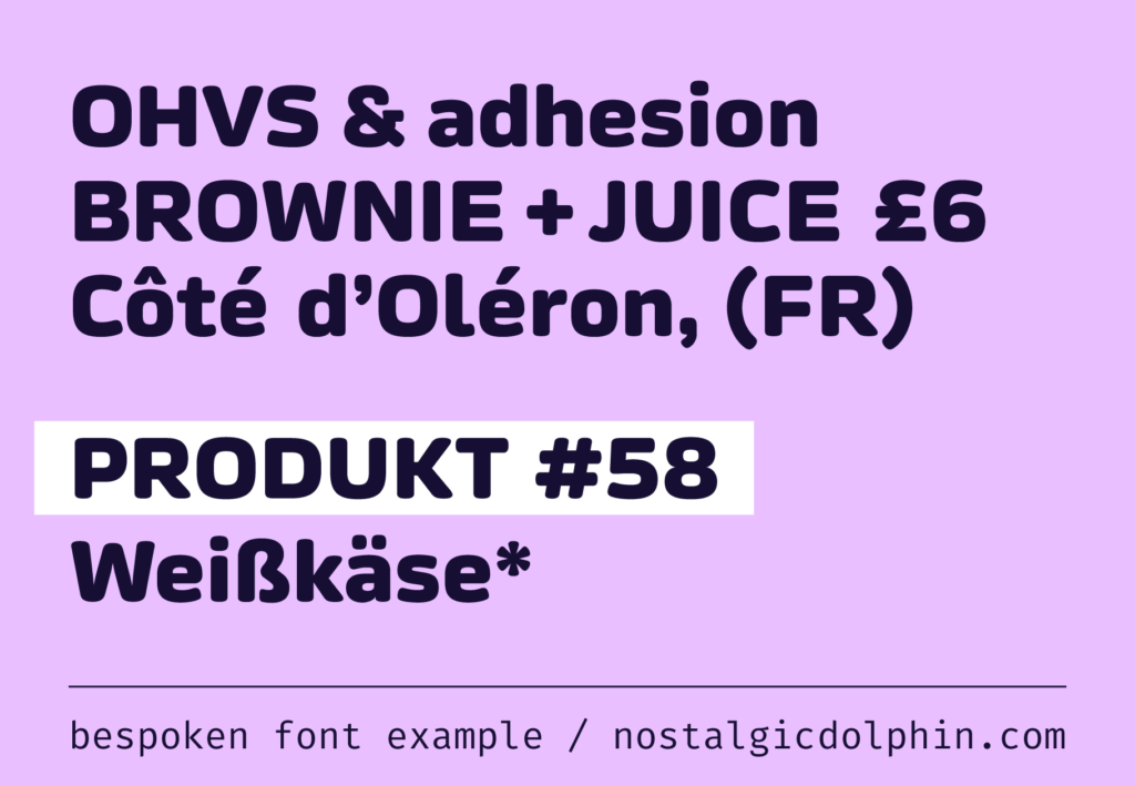
There a few main reasons to bespoke a custom typography:
The typography is designed to fit the brand exactly, instead of looking for fonts that are more or less adequate but rarely the perfect match.
It ensures the absolute uniqueness, since that brand is the sole user.
The client owns the rights and doesn’t think about different license types and terms.
Often, it’s cheaper than trying to cover the same use cases by purchasing an array of different commercial licenses.
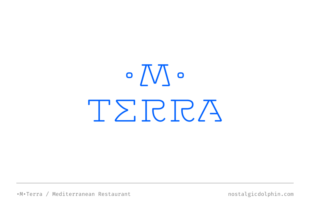
The idea usually stems right from the logo where the general visual tone of the whole branding is established. Some situations call for a versatile, custom-tailored typographic solution that would work perfectly with the theme or a symbol. A special case is wordmark — logo design solely relying on custom typography. It is a powerful branding weapon since it leverages the highest level of visual sublimation by using your business name as a symbol. Think of Coca-Cola®, Google® or Disney®. Aside from the logo, some businesses commission a typography for a particular campaign or font for general use inside the company.
We are professional type designers who can design world-class custom typography for your brand. Comprehensive theory research and practical work on diverse type projects make us fully competent to complete the whole font production process. From defining the concept and drawing curves to spacing, kerning, coding OpenType features, expanding character set, and language support. Our fonts are designed by variable paradigm and prepared for interpolation. We cover Latin & Cyrillic scripts.
CYRILLIC DESIGN
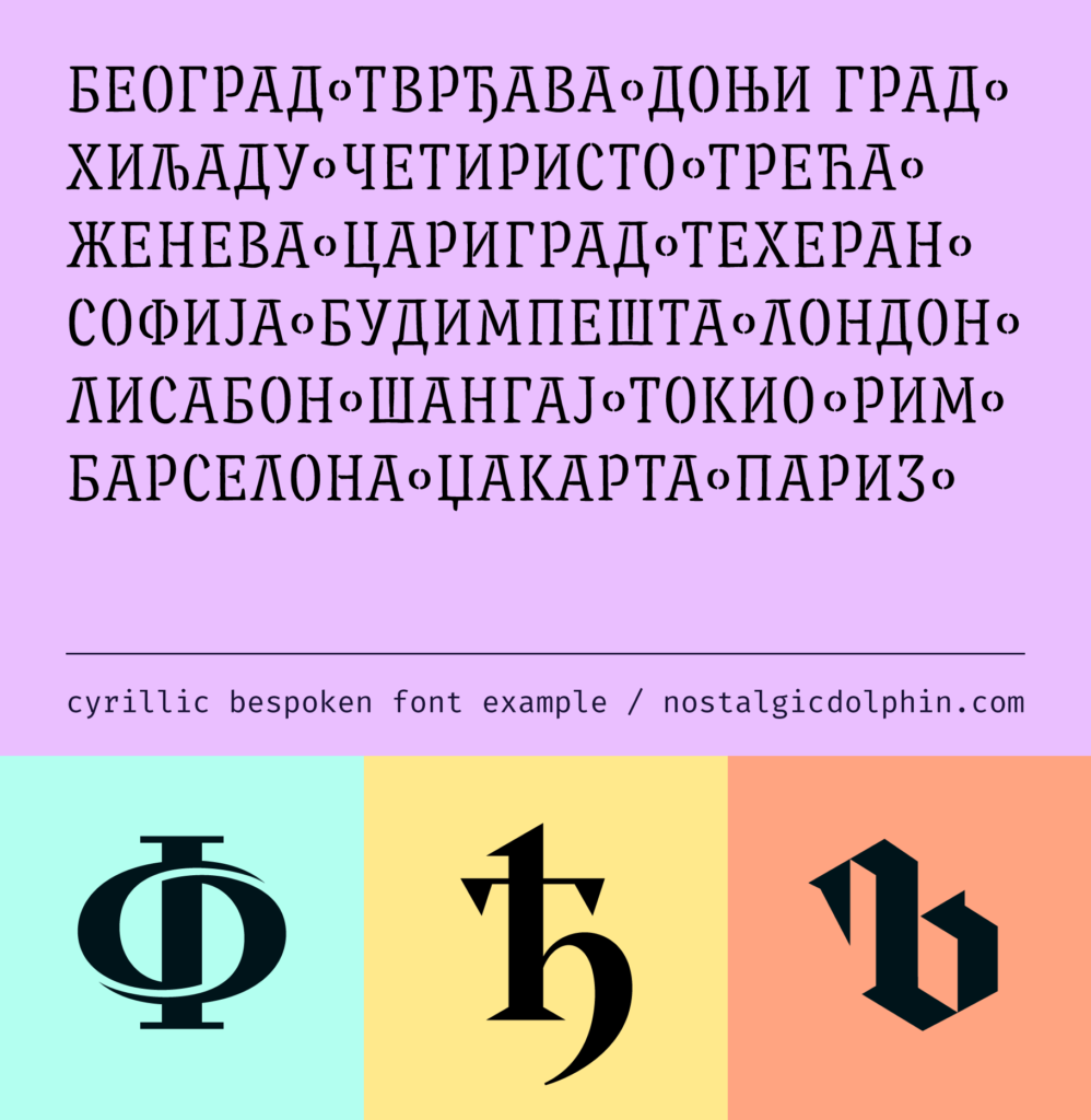
If your brand aims toward Cyrillic users we are the perfect match. Being native Cyrillic type designers we have a strong sense for nuances in the personality of Cyrillic type forms and understand relations between Latin and Cyrillic set of the same typeface. Whether is a new brand or localization of the existing brand for the Cyrillic market it’s an area of our expertise.
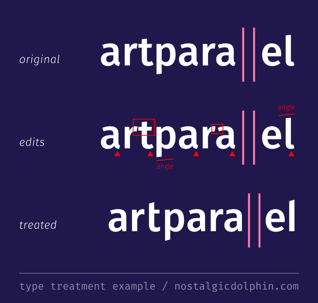
TYPE TREATMENT
In short, this means polishing the look of your existing logo typography. Even if a business decides to use a retail font for a logo many of them still need type treatment. That is to fine-tune the look of the particular character combination. Being professional type designers we know that simply typing the brand name in any particular font is rarely enough. Font makers can’t fully control each letter combination and resolve all inter-character conflicts inherent to the letterforms on a font level. To be used for a logo or as a wordmark it most often needs additional fine-tuning. These are typically quick tasks.
