BLOG POST #3
SERBIAN CYRILLIC PART 2 — TRUE ITALIC
October 31, 2024
In the earlier article, I covered the design of upright Cyrillic letterforms used in Serbian:
➔SERBIAN CYRILLIC PART 1 — UPRIGHT
This is a follow-up article that completes the Serbian Cyrillic design. While Macedonian Cyrillic shares a lot of these specifics with Serbian, it deserves a separate article because its letters Ѓ ѓ, Ќ ќ, and Ѕ ѕ, are not used in Serbian. Some issues covered here are still not unambiguously defined in real life. I tried to understand the standards and where they are lacking to give my personal opinion backed up with universal type design argumentation. This text might be updated in the future according to possible new findings. Thanks to Ana Prodanović for offering her opinion, valuable insights, and useful links. Again, as a general note, please take this article as an attempt to describe the “default” in standard type design, not as a hard rule that limits the joy of creation.
We can divide the forms covered in this article into two sets:
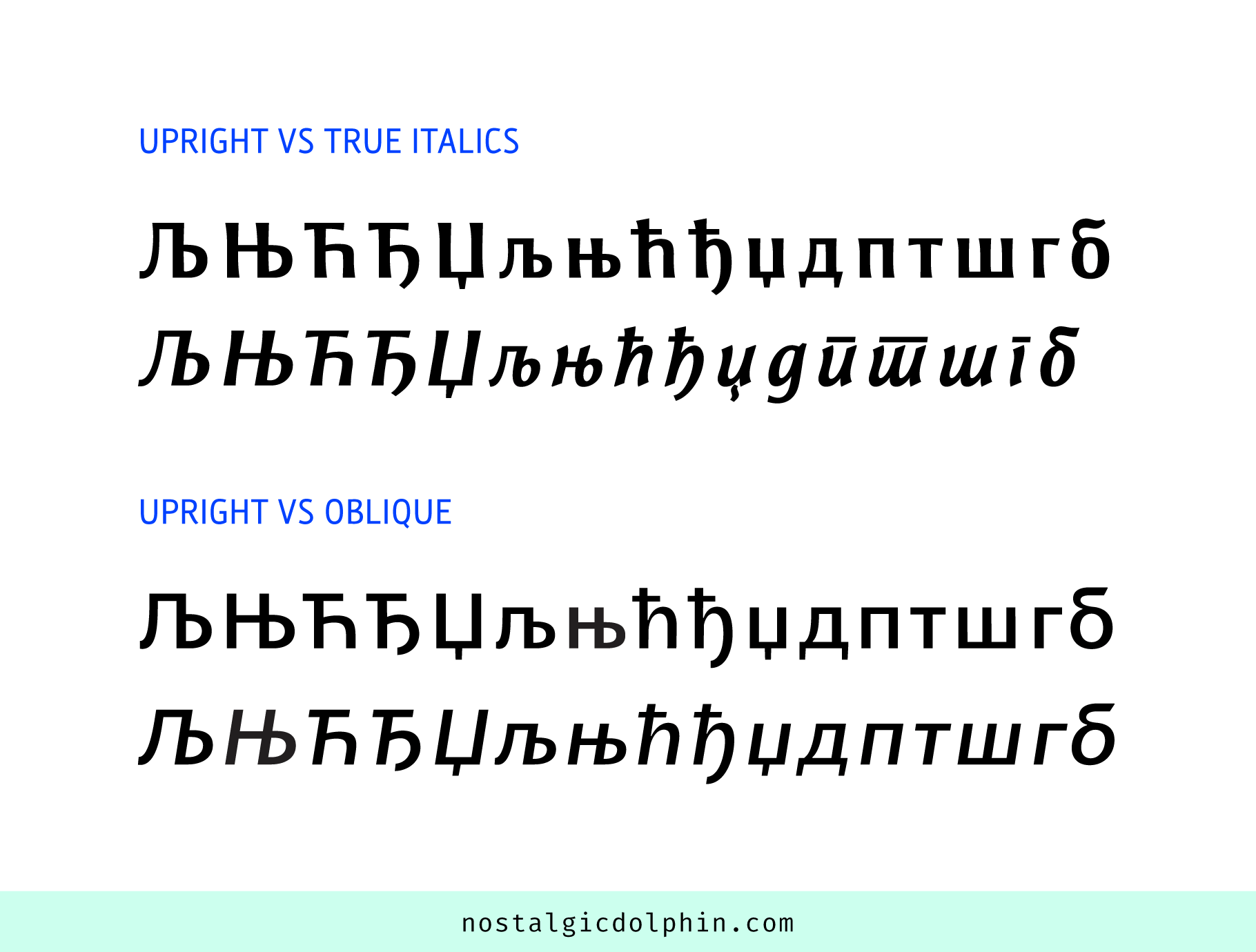
I. The first one is italic forms of Њ, Љ, Ћ, Ч, and Џ (caps and lowercase). The upright forms of these letters are covered in the previous article, and they all have assigned Unicode values.
II. The other set is Serbian local italic forms for д, п, т, ш, г, and б (all lowercase). Since default forms of these letters are present in other Cyrillic alphabets, they don’t have Unicode values but are activated through the OpenType substitution feature “locl”, plus as a stylistic set.
This article describes only true italic forms. Except for getting the general type treatment that italics get (proportion, optical corrections) sometimes these letters are “basically slanted upright forms”, and that’s how I refer to them in the text. Other times, they have quite different forms. These later are sometimes wrongly present even in strictly oblique typefaces, because designers think they are mandatory. Oblique is generic in its nature, and oblique Cyrillic is also nothing more than that — oblique, and true italic forms are not necessary then.
I. UNICODE ITALICS
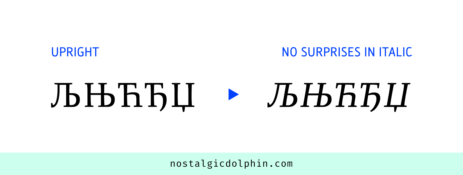
ITALIC CAPITAL Њ, Љ, Ћ, Ђ, and Џ
Basically slanted upright forms.
ITALIC LOWERCASE њ AND љ
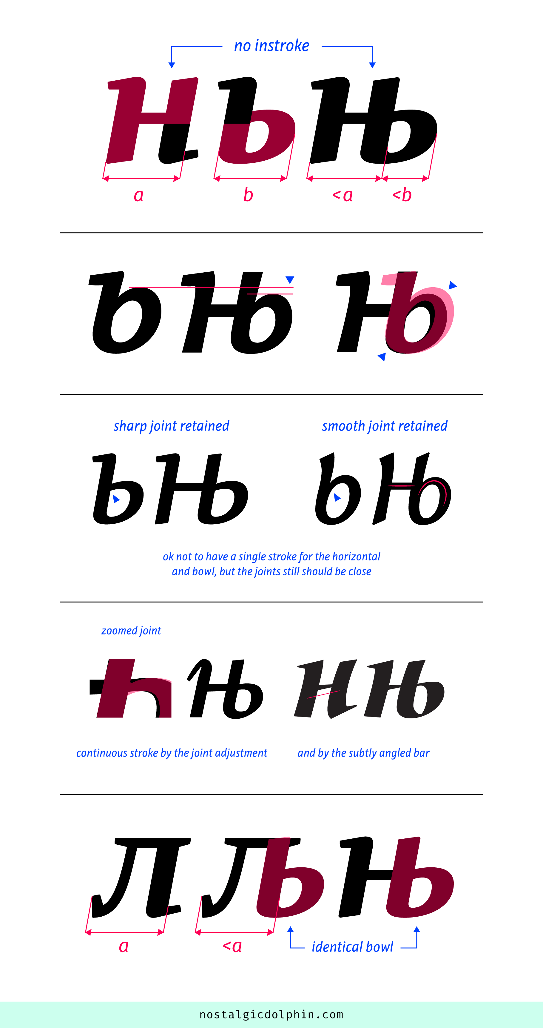
It uses the same formula as upright, combining /н and /ь (soft sign). The left stem, horizontal, and top of the right stem are taken from /н. The rest is taken from /ь. Hence, if /н has no instroke on the right stem — which is most often — /њ has neither. The bowl keeps the general construction as for /ь, which means it can have horizontal, sharp, or smooth joint. As in upright, both components are usually a bit narrowed. The bowl can be a bit lowered to follow the width reduction, and to meet the horizontal. That sometimes requires subtle adjustments for the whole curve (including the southwest quarter) for the sake of stability and curve quality.
For upright we have a suggestion to merge horizontal and bowl into one continuous stroke. But for italic /ь, the bowl often has a round counter and smooth joint with its stem which is significantly lower than the bowl’s top extremum. In italics, it is ok to keep the bowl counter round, and just adjust its height in order to meet the horizontal at a similar height, instead of flattening the bowl top (making a sharp joint) in order to force a continuous stroke with the horizontal. However, if /ь joint is sharp, subtly adjusting it to make a single stroke connection is still a preference. There are cases where /н bar is slightly angled counterclockwise so the connection with the bowl in is established. This works only if it’s subtle because otherwise /н alone risks to look like oblique /и.
Italic /љ follows the same logic, combining /л and /ь. Its bowl is identical to /њ.
ITALIC LOWERCASE ћ AND ђ
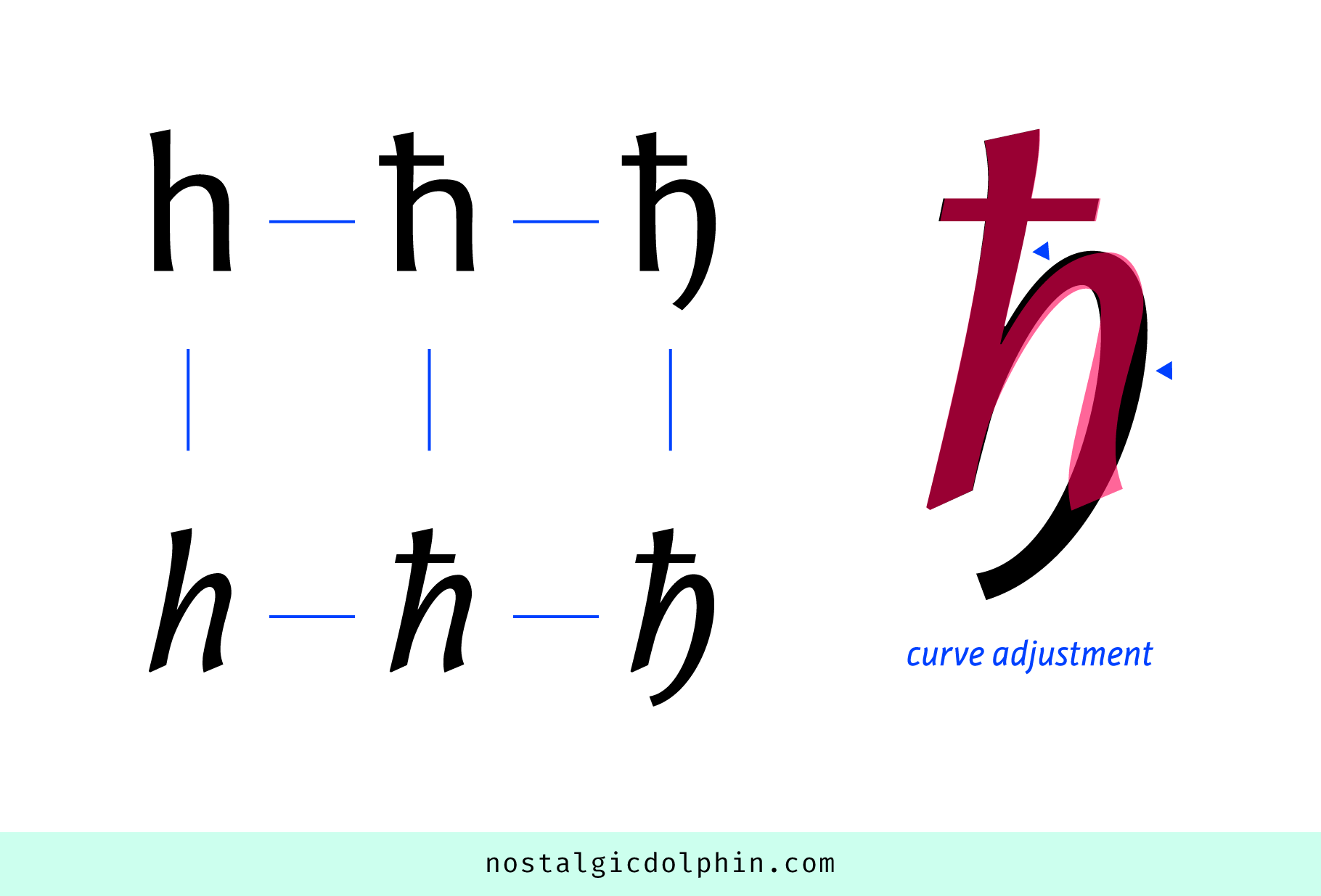
Italic /ћ uses the Latin italic /h as a base. It further follows the same relation between upright /ћ and upright /h. There is nothing surprising with italic /ђ either. Compared to italic /ћ, the joint curve of italic /ђ is usually a bit modified to accommodate the curved descending tail on the right-hand side.
ITALIC LOWERCASE џ
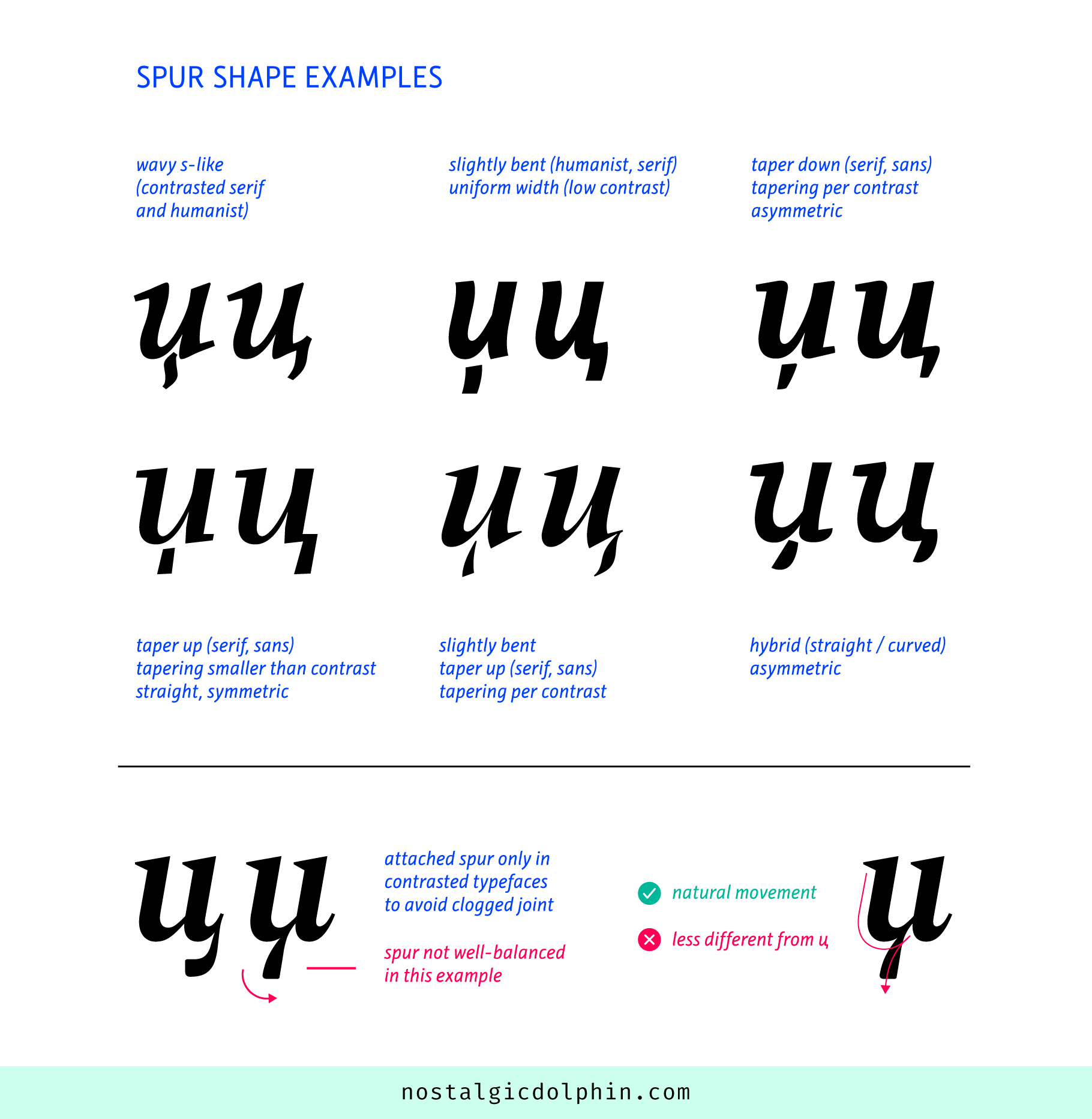
The base is italic /и (the same as the Latin lowercase italic /u). The spur is detached in italics, which is an influence from the handwritten form. In the horizontal direction, it should be visually centered with the base. If unsure, it is better to move it a bit left than a bit right, to clearly differentiate /џ from /ц.
Vertically, its bottom part is lower than the bottom of the /ц spur. If there is a need spur should use the full descender, rather than being squeezed, moved too close to the base, or placed in the white space around the base joint. This latest option uncenters the spur, moves it closer to /ц position, and possibly clogs the joint at a smaller size, and is your last resort if there is not enough descender space. Lowercase Cyrillic anyway lacks ascender and descender extensions, so using the full descender space can only increase readability (although /џ is the rarest letter in Serbian, and third rarest in Macedonian). The gap between the spur and base varies, but the distance of usual Latin diacritics from their base could be taken as a starting point. The spur size should visually match the /ц spur. Better a bit bigger than a bit smaller.
The spur shape follows one of the two logics. The first comes from upright where the shapes of /џ and /ц spurs are correlated, and is prevalent both for sans and serifs (about 80% of typefaces). Here you can use the /ц spur as a starting point, cut it somewhere near the /ц outstroke midline (see image), and then adjust according to universal typographic principles of balance, color, or creative preference. The second is from handwriting where the spurs are deliberately different, which opens some creative space.
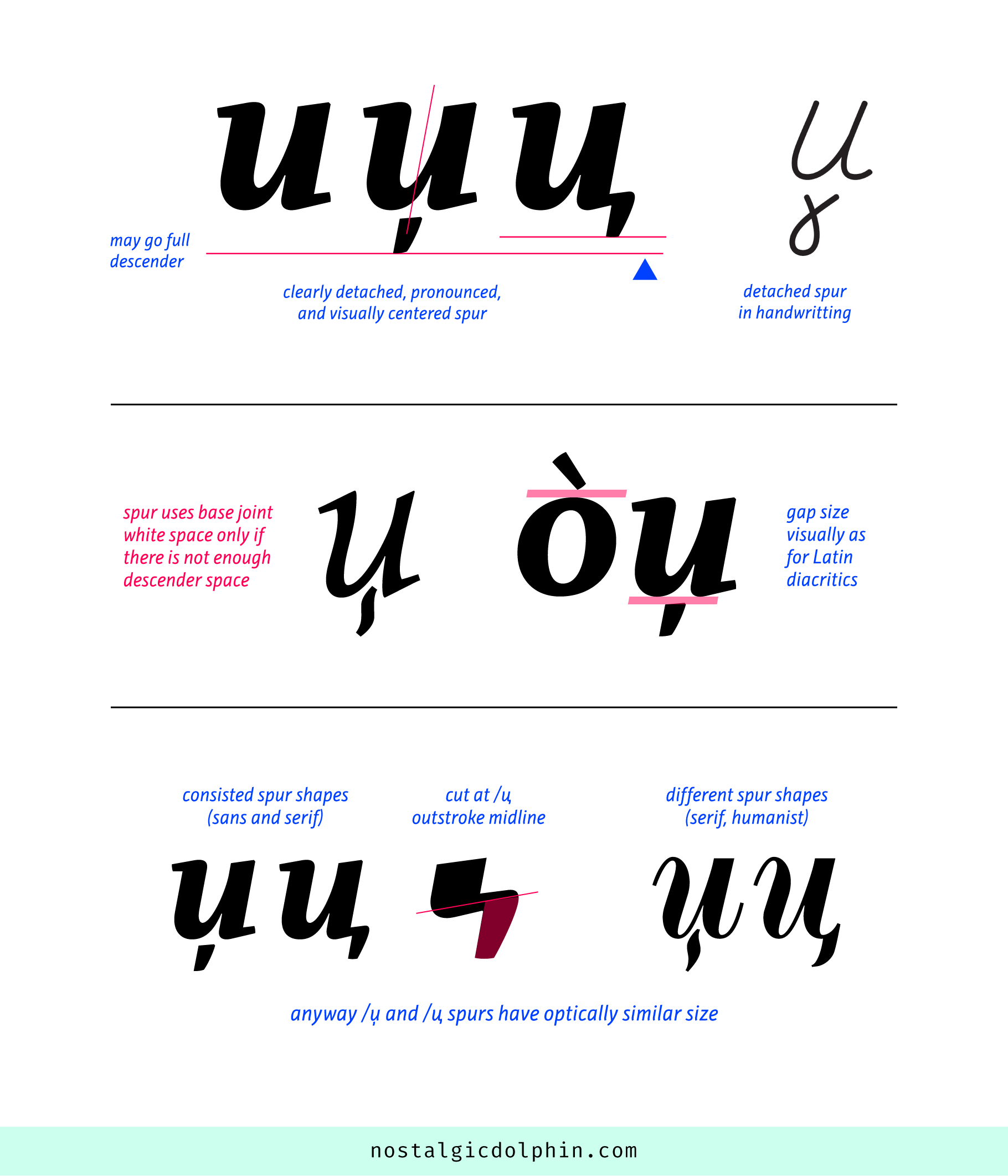
This option occurs in serif and humanistic typefaces, rarely in sans. The spur shape varies. It can be straight, slightly bent, or wavy (tilde-like). Uniform width or tapered (up/down). Symmetric or asymmetric. Top and bottom terminals may be cut at various angles. I like tapering toward the base, which resembles the logic of the Latin diacritics. It lightens the contact, makes a whole element more prominent, and reminds of the script form.
It’s worth mentioning that there are examples with attached spur. Since it originates from caligraphy logic, it fits with contrasted (to avoid joint clogging) serif and humanist typefaces. Its ductus makes sense, and I would say it is not wrong in general. Just make sure the shape horizontally balances well with the base. On the other side, detachment was one of the things that efficiently distinguished /џ from /ц.
NOTE ABOUT KERNING
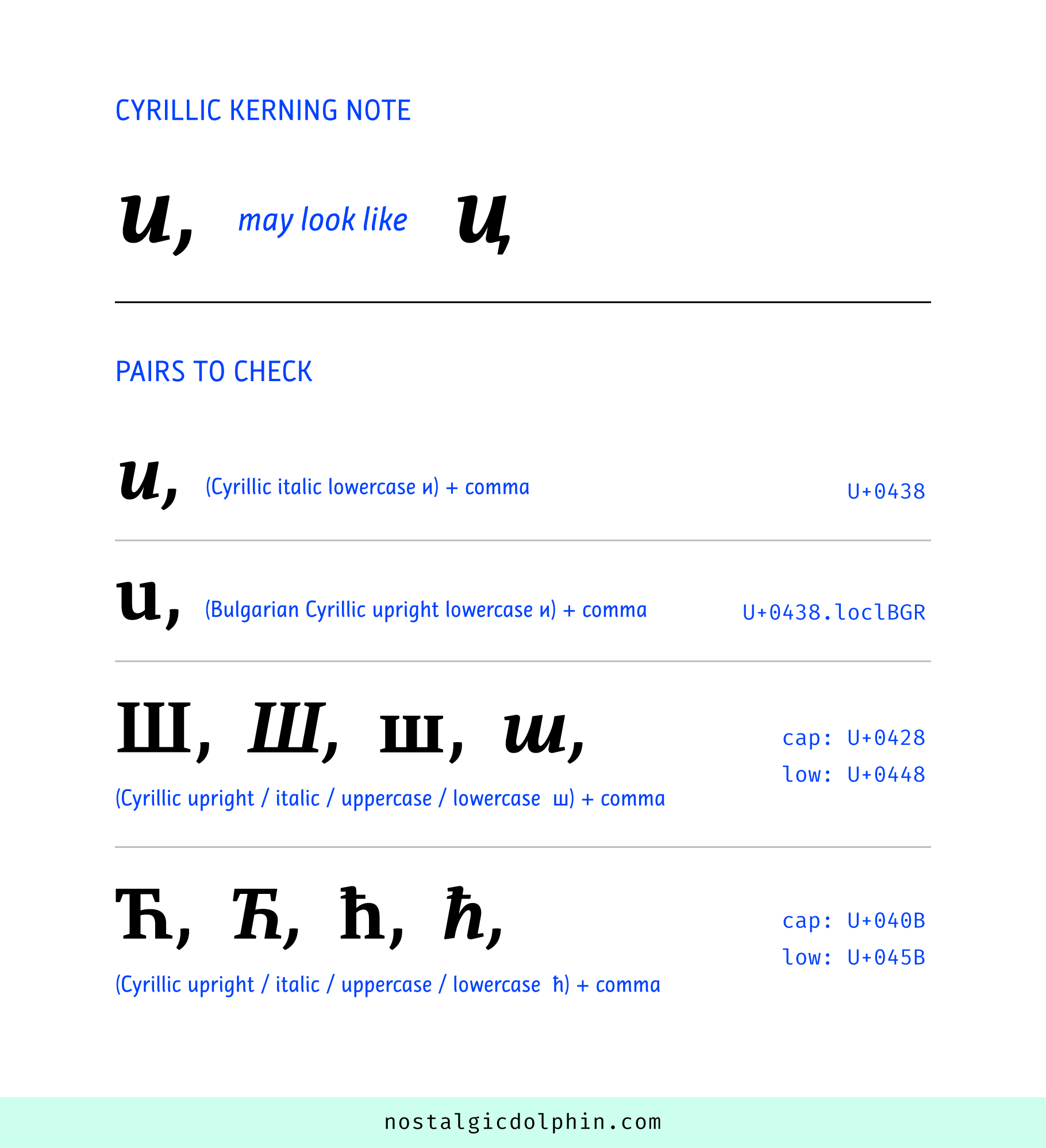
For Cyrillic in general, having a comma too close to some letters may wrongly appear as a spurred letter. So it makes sense to check possibly problematic kerning pairs. Lowercase italic Cyrillic /и (or its Bulgarian upright form) followed by a comma may appear as /ц. Or /ш might look like /щ (in italic, upright, lowercase, and caps). Also, /ћ might look like /ђ (in italic, upright, lowercase, and caps). And probably many other combinations in non-Slavic Cyrillic languages that utilize baseline spur more.
II. ITALIC LOCAL FORMS
All of these forms are lowercase and with one possible exception (/б upright) italic. As mentioned above, these forms have no Unicode values, but are implemented using the “locl” OpenType feature. But in addition, it is also wise to add them as a stylistic set through the classic “salt” feature, because this is a fallback option and pretty convenient in some situations. More about coding “locl” feature is on THIS LINK (localfonts.eu).
ITALIC LOWERCASE д
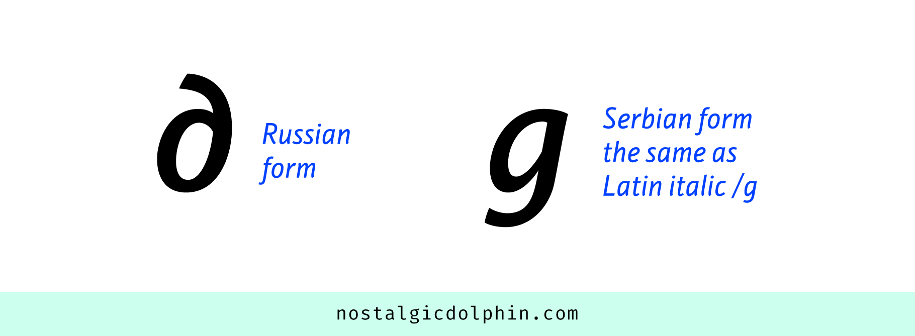
Let’s start with the easiest. Instead of the classic Russian form, the Serbian form is exactly the same as the italic Latin /g.
ITALIC LOWERCASE п, т, AND POSSIBLY ш
The additional line for these forms is a nice invention that originates from the connected script where the sequence made od /и, /ш, and some other letters may appear hardy distinguishable (spring effect). Lines aid readability by marking the zones of different letters.
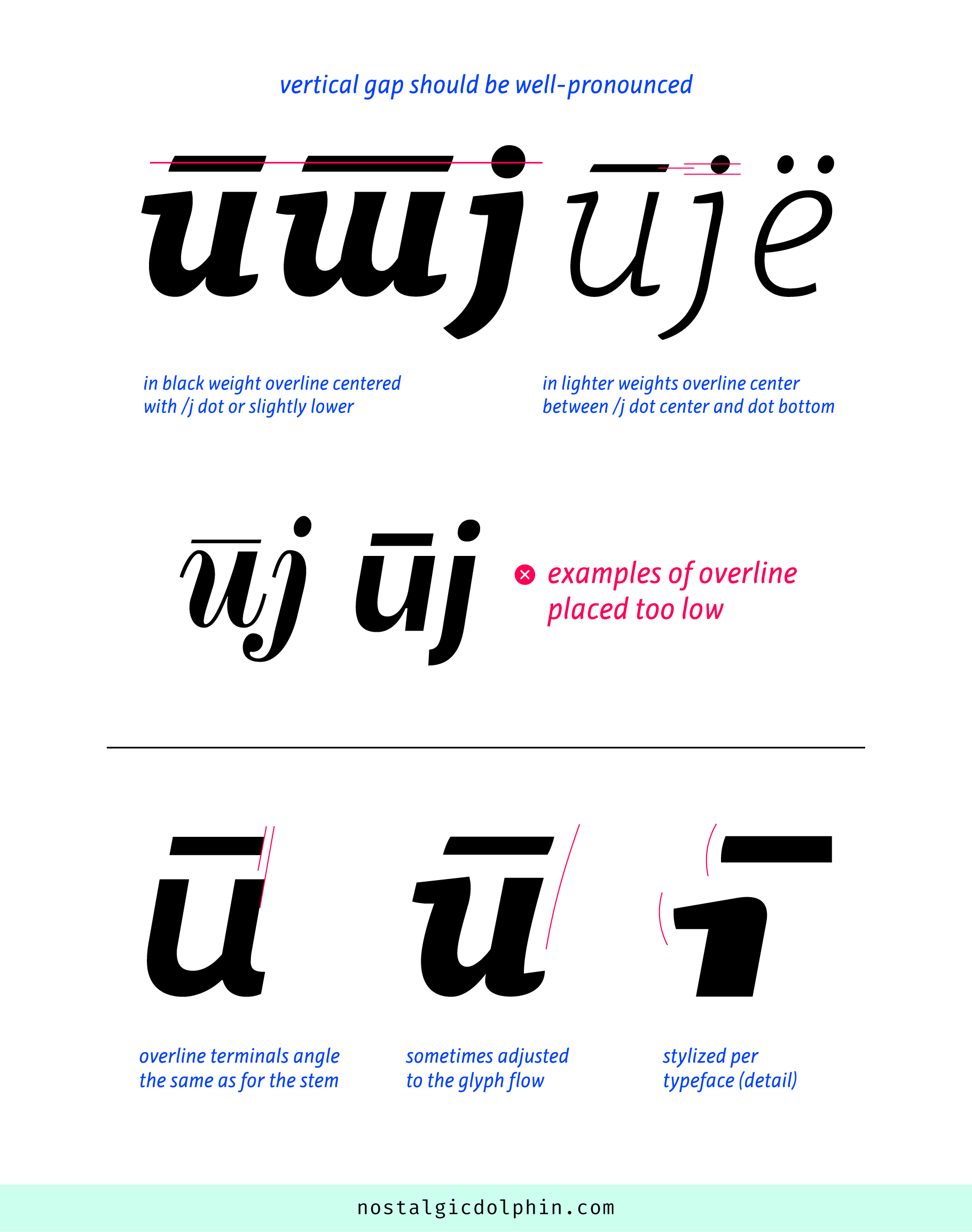
Lowercase italic Serbian /п use italic /и as a base and overline above. While the vertical position and thickness of the line are the same as for the macron accent, the usual mistake is making the line too narrow. It is visually centered and wider than the counter. In this description, I didn’t use /ћ bar as a reference, since it has its own problems to solve varying position and thickness depending on the typeface and weight.
A good reference width is between the extended outer edges of the stems. Sans fonts without left instroke might keep that reference width, or move line terminals inside a bit, but not too much (maximum half stem width in light or a third of the stem in black). Serif and humanist faces with left instroke usually match the reference width or have the left line terminal extended a bit to compensate for the instroke (not too much again, maximum half of the instroke width). After this, a subtle horizontal positioning could be made to balance with the base.
The thickness is the same as for the macron. Sometimes just slightly thinner if you use the same macron for caps and lows because /п overline is only for lowercase. If you don’t already have a macron designed, the typical starting point for the thickness could be the horizontal bar of Cyrillic /н. For high-contrast typefaces overline is usually slightly thicker, and for low-contrast and bolder weights slightly thinner than that. Then you could visually adjust it to match it with other diacritics.
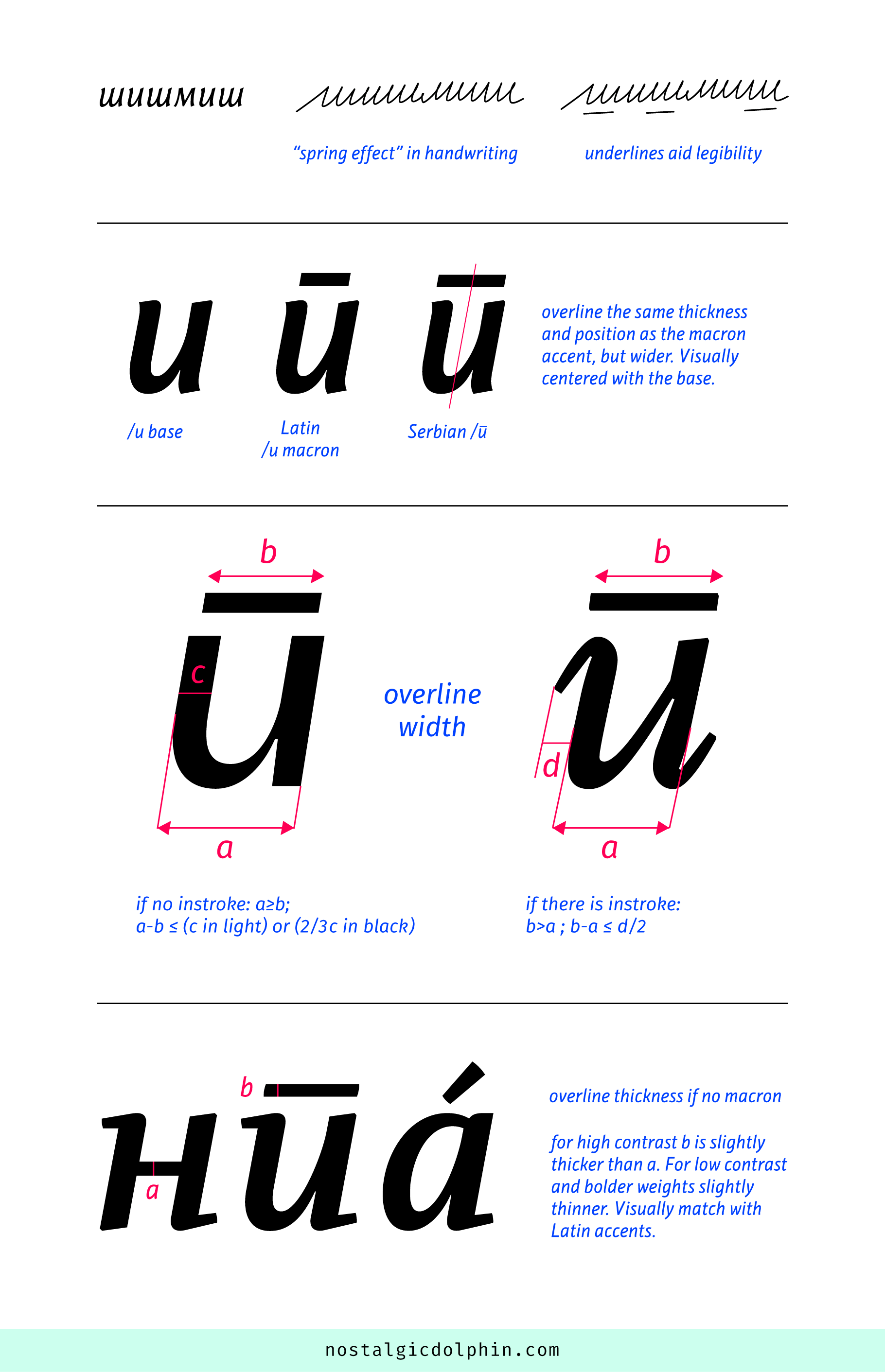
The other usual mistake is placing the overline too close to the base. Its vertical position is such that it should be clearly detached from the base at smaller text sizes and bolder weights. As a reference, in the black weight, you can center the overline with the /j dot (the Serbian language uses an identical /j as the Latin) or maybe just slightly lower depending on the typeface. In lighter weights, it can go down, but since the /п line blocks more space than the /j dot, the overline bottom in any case should end up higher than the /j dot bottom. Also, take into account that /т overline lies at the same height as /п, it is much wider and blocks even more space. You can also check Russian italic /ё (e dieresis) along with these characters. Overline terminals follow the angle of the base stems. Not being combining diacritic, but rather the integral part of the specific glyph, the overline angles are sometimes slightly adjusted to balance with the base. However, it’s important not to overdo it. They are shaped like the other terminals in the typeface.
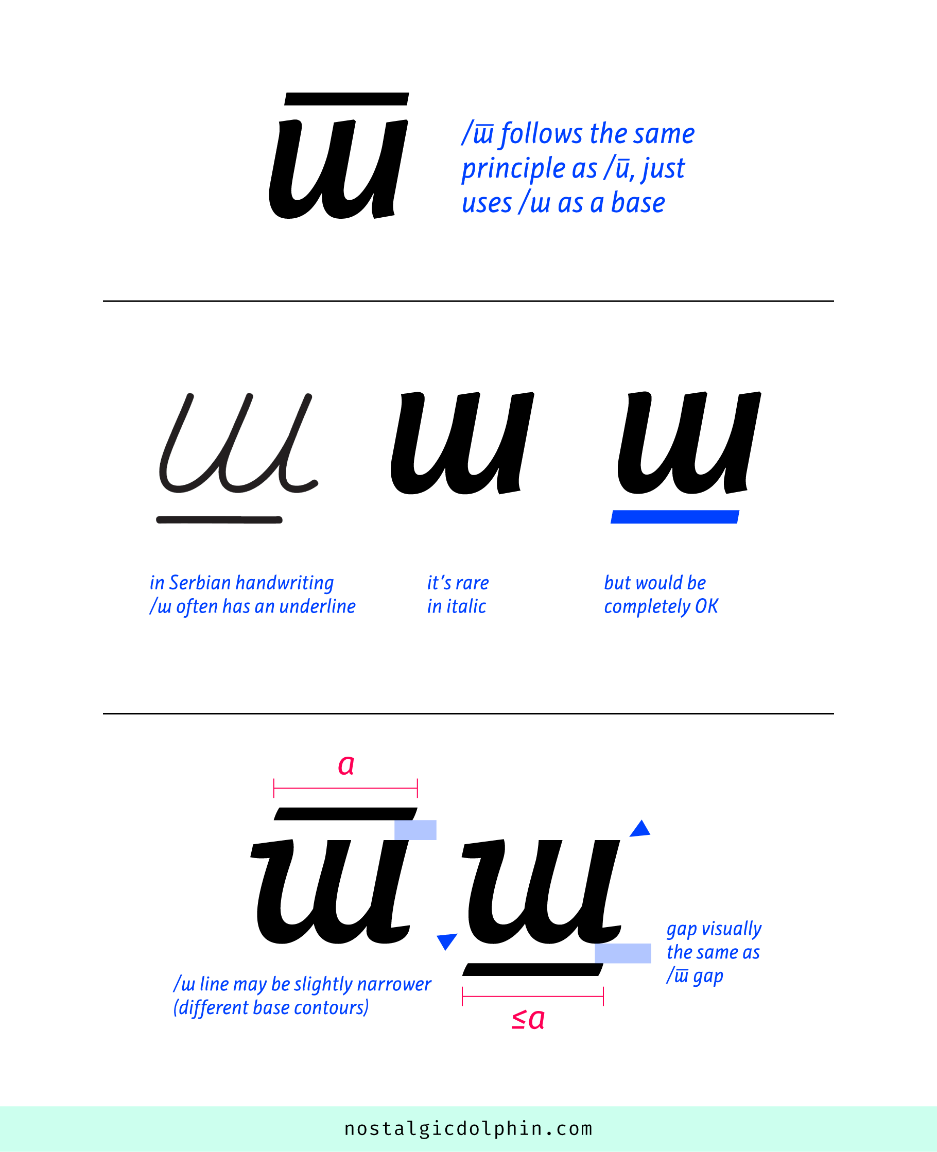
/т design follows the exact same principle, so its line is extended. The reference width is between the extended outer edge of the leftmost and rightmost stem.
Lowercase italic /ш in Serbian is most often the same as in Russian (without underline). However, it’s worth mentioning that the official orthography of Serbian Cyrillic handwriting allows underlining italic /ш as an optional form. In school, most of us learned to write /ш with the underline. Some Serbian designers have a stance that in standard italic typefaces, it should be avoided as it is a redundant extra stroke. Some others think that lines for /п and /т are nice inventions and if their scribal forms survived in italics, then /ш could be underlined as well because it aids readability even if the letters are not connected. If designed, it should start with positioning the /т line below /ш to visually match the /т gap size. Its width might be slightly narrower to compensate for the different top and bottom contours of its base.
ITALIC LOWERCASE г
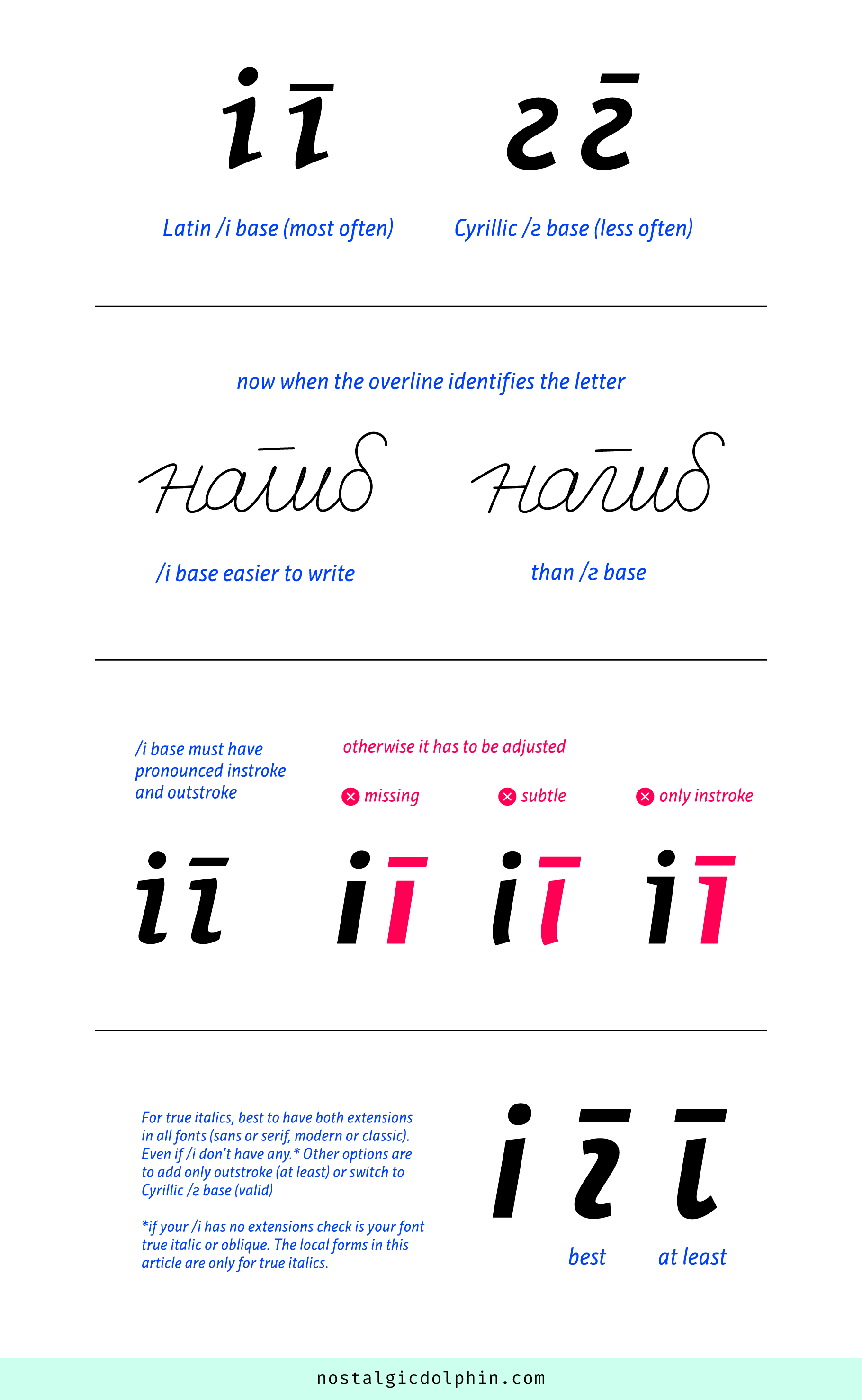
In most fonts by Serbian designers, the lowercase italic /г uses Latin /i as a base. Less often, Cyrillic /г. However, the latter is presented in the official Serbian orthography (2022), and Macedonian also uses it. I assume that once the overline was introduced in Serbian, people gradually stopped spending effort in writing inflected curves of /г, and resorted to Latin /i base as an easier form because the letter identity is now carried by the overline anyway.
My opinion is that the Latin /i base is the most natural, but it has to have well-pronounced instroke and outstroke. For typefaces where /i instroke and outstroke are missing, are subtle, or where /i has only top instroke but not bottom outstroke /i couldn’t be used as it is, and it should be customized. The thing is that people in Serbia don’t understand the italic /г contextually close to /i in any way. Having a simple slanted stroke as a base just looks odd. In/out extensions make the whole glyph more natural and better balance the width of the overline and base.
My preference for all fonts that have true italics (sans or serif, modern or classic) is to have both extensions, even if italic /i has none. However, if /i has no extensions, chances are that you are in the oblique realm then, and here described local forms are not relevant. Other options are to add bottom outstroke (at least) or to switch to Cyrillic /г as a base (valid).
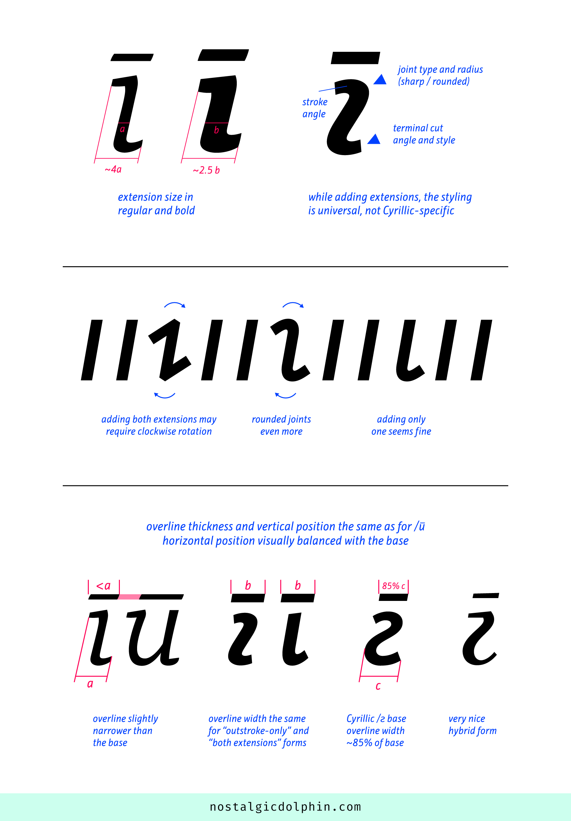
As per /i customization, if your typeface already has instroke and outstroke instances you can start from there. If they are subtle, you can make them more pronounced respecting the style and flow of your typeface (this is not incosistency since the base is not /i in its nature). Better to have them a bit bigger than a bit smaller. As a ballpark for regular style (normal width typeface), the width of the base (with both extensions) could be ~400% of the stem width. As the weight increases the percentage naturally falls, so it could be ~300% in bold and ~250% in black. These are very rough numbers just to give a general sense of the size.
If you don’t have instrokes and outstrokes elsewhere in your italic, you should take the general style and flow of your typeface as the main reference while adding extensions, just as you would do for Latin. The extensions could be angled or horizontal, their terminals cut and style varies, the joint with stem could be sharp or round, and the radius of the rounded joint could be bigger or smaller. I won’t elaborate on it here, since it’s the general type design topic, not Cyrillic or local specific. Just a note that adding both extensions may require clockwise rotation of the form, to visually preserve the italics angle (rounded joint more than sharp). Seems that adding only one extension doesn’t unbalance the original angle.
The thickness and vertical position of the overline are the same as for /п. For the i-based option with both extensions, the line is just slightly narrower than the base and visually balanced above it. Even if the base has only the outstroke (and not the instroke), the width of the line is the same as for the form with both extensions. For the overline above the Cyrillic /г base, you can start with ~85% of the base width and then see. Better bit bigger than smaller. I found a beautiful hybrid form designed by Lasko Dzurovski, where the base starts with a sharp joint instroke and then develops into Cyrillic /г. Its overline widens toward the right, which works well for this typeface.
ITALIC LOWERCASE б
This is the least important local form of Serbian Cyrillic among all described here, but it still has the longest description. Serbian people would read the classic /б form as easy, and in general, a few common people know for “Serbian /б”. If asked they would probably consider it as a mere stylistic choice. Since its origin is purely handwritten, the form is even less mandatory in the upright. However, it is an emerging tendency in local type design that has a domestic flavour, so if you have the time it is a nice addition to your Cyrillic set.
In the handwritten Cyrillic, various handwritten forms existed in parallel with each other. The instructional textbooks tried to sum them up, like “Propisi” (“Regulations”) written by Zaharije Orfelin (1776). Serbian /б originates from a form with a different ductus than classic /б. It has its merits, since the left edge is not continuous, thus differentiating it from numeral /6 more clearly. Also, seems that the form varies less than the classic /б, because the branch doesn’t have many options and space to make a sudden turn. That’s the main problem at the same time. Here I am describing the upright form because it’s easier for analysis. The italic follows the same logic.
The base is lowercase /o. As the weight increases, in typefaces with a large x-height, “o” part might go below it to accommodate the branch. In turn, it also might be slightly narrower to avoid a squashed look. The joint with the branch might become clogged, especially for bolder low-contrast typefaces, or if the joint is smooth (less problem if it is sharp). This is solved mostly by attenuating the branch at the joint, but sometimes the base might be edited also. For text typefaces, the most common mistake while designing Serbian /б is to have its base too different from /o. If so, one can instantly notice instances of /б all across the text. Avoid the base being too short, too asymmetric, or having a baggy waterdrop look (except if your /o looks like that).
Some serif and humanist typefaces edit the /o base to emphasize the handwritten ductus, by morphing the branch and right-hand part of the base into one continuous stroke. This gives the glyph the Greek lowercase /δ (delta) look and pushes the inflection up below the branch horizontal stroke, which is the thinnest point now (earlier it was a joint). The top right quarter of the base is affected the most, but fine balance adjustments for the whole “o” part are possible. The base and its counter are not symmetrical anymore. As per the position of the thinnest point, there are contrasted typefaces with classic /o base (not delta-like), but still, the thinnest point is not at the joint but somewhat up on the branch. The idea is to widen the branch naturally toward the base to reach its thickness at the joint point.
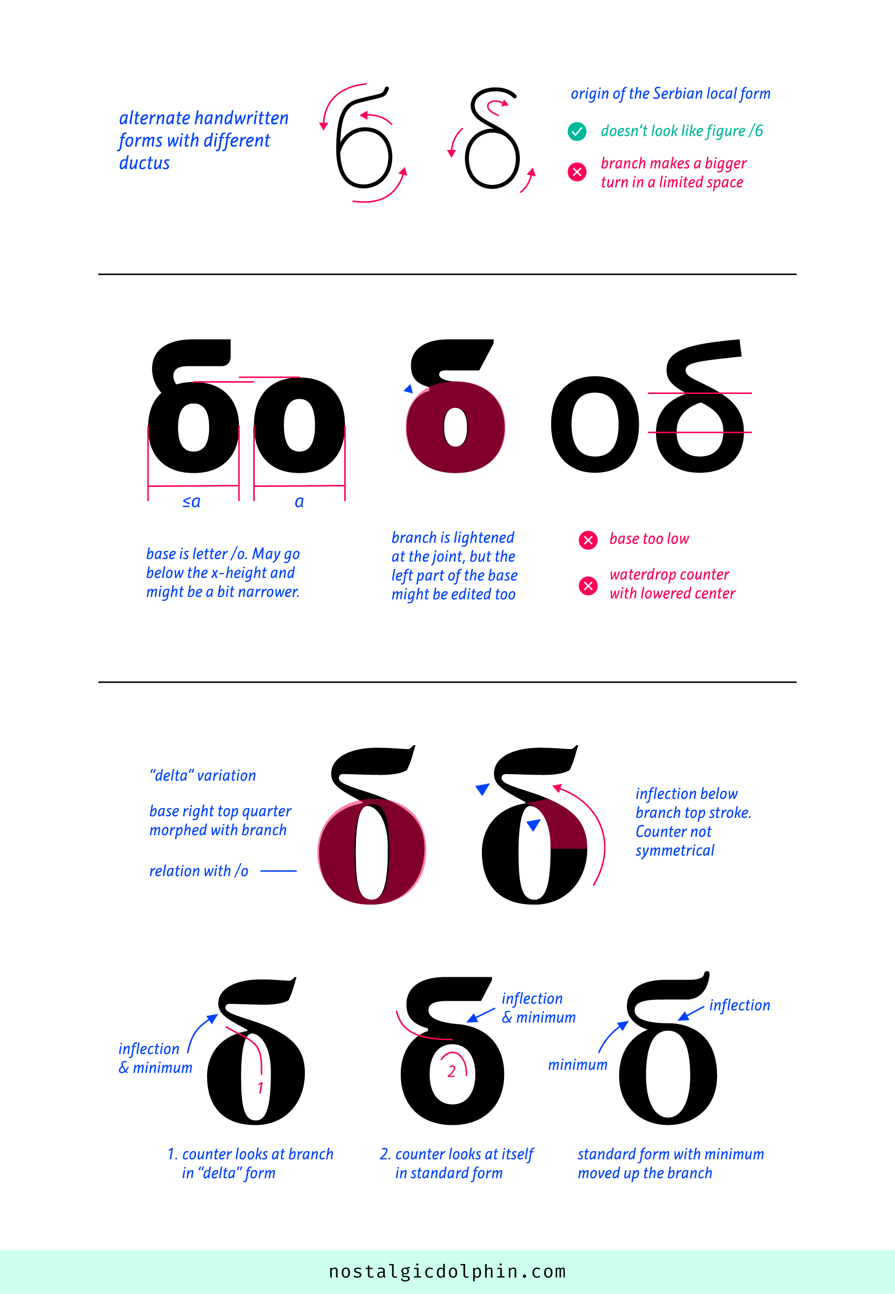
The branch is, expectedly, a bit narrower than the base because of stability. It can make a smooth or sharp joint to the base. It is the thinnest at the joint (except in the two cases described above) and is the same or thinner than the /o thin extremum. It gradually widens toward the top horizontal stroke which is the tick stroke in contrasted typefaces (branch turn is thin) and is usually somewhat thinner than the thick /o extremum (certainly thicker than thin /o extremum). This weight distribution is the same for low-contrast typefaces and is retained in bolder weights. Delta-like form follows, except its thinnest branch point is moved up.
The top stroke could take a few standard forms. First, it could be straight — it is not mandatory to have inflection. This is seen in all types of typefaces (sans, serif, humanist). A classic inflection is usual in serif and humanist typefaces. There is also a pseudo-inflection that feels more structured. Here, the top stroke is basically down-curved but then ends with an upserif. Some humanist typefaces that have some form or serif (for example on stems for /i or /n) use this form too.
The sans-serif terminal is per your typeface style (vertical, normal, or angled). As per serif and the top stroke style in general, a good reference is the leg of the Cyrillic /к. While it is not mandatory for the top stroke to resemble the style of /к, one should be aware of the stylistic relation between these two elements. The angle of the serif more or less points north-west. The vertical serif is possible but could look a bit unnatural (especially if it is thick).
The second most common mistake with Serbian /б is making the top stroke go too upward. While it could be acceptable in more creative and display typefaces, if it goes up too much, it immediately sticks out in the text. Looking at it in overall (not upserif element only) it is much more horizontal than in the classic /б. As per the branch shape, please also check these two articles about the standard Cyrillic /б from Alexandra Korolkova (especially the “squirrel vs. rat tail” note) and Gayaneh Bagdasaryan. They are not about Serbian /б but establish the matter nicely. At last, the form of the top stroke can be hybrid, with edges being not parallel or being different shapes — for example, one straight, the other curved (this implies contrast). It is a space for experimentation, and probably is safer for display typefaces, but is present in subtle form in text typefaces as well.
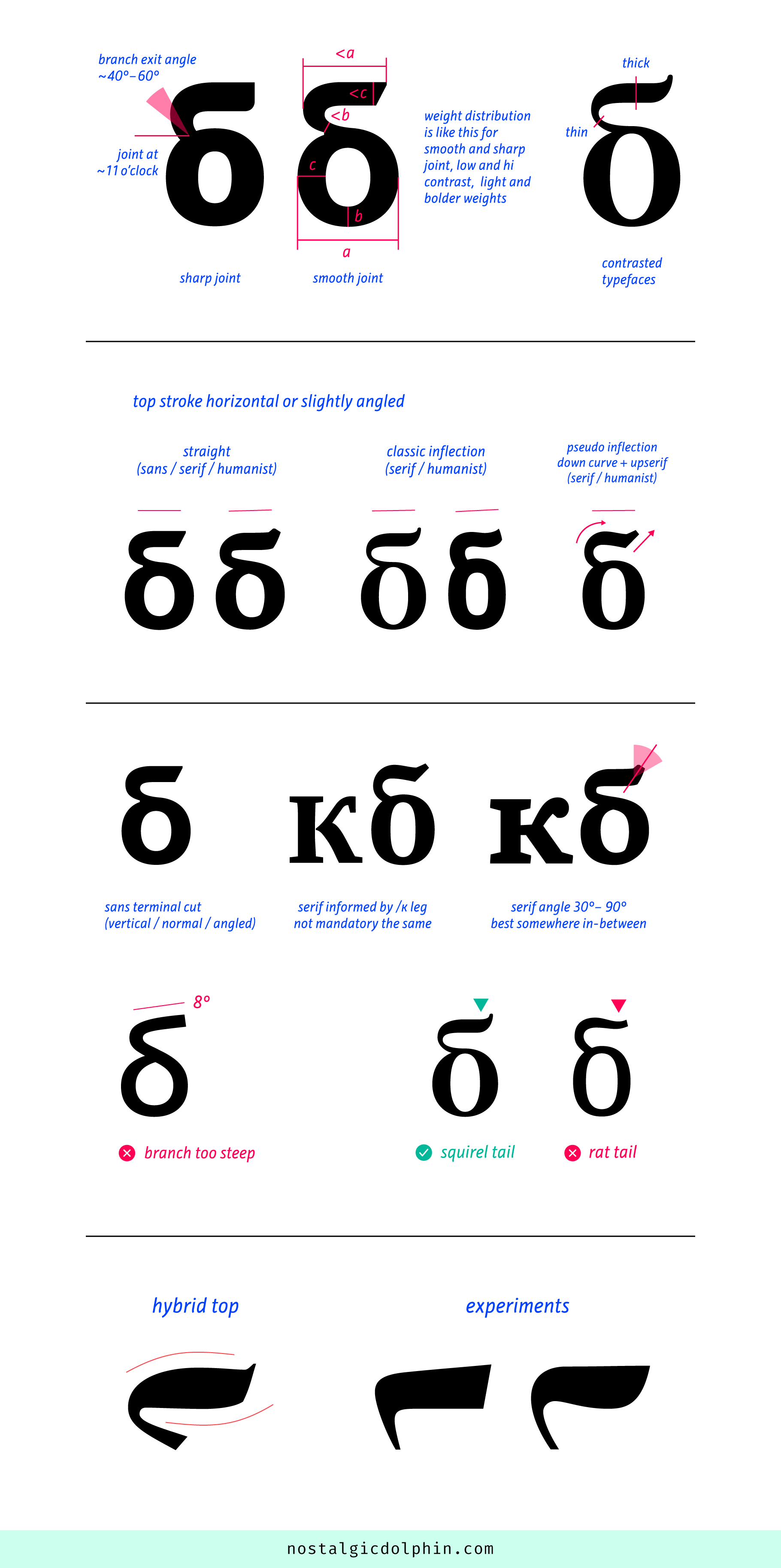
In the images are these great fonts: Resavska BG (Serif and Sans), Neo Geo, PF Adamant Pro (Serif and Sans), Obla, Chiavettieri, ITC New Veljovic Pro, Nocturno BG, Neoplanta BG, Influ BG, Platan BG, Skola Sans, Spectral, Open Sans, Bukvar.
SELECTED SOURCES (NOT LINKED IN THE TEXT):
- “Istorija srpske ćirilice” (The History of Serbian Cyrillic), Petar Đorđić, 1971.
- “Pravopis srpskoga jezika” (The Official Serbian Ortography), Matica srpska, 2022.
- “New School Handwriting Typeface”, PhD Thesis, JANA ORŠOLIĆ, 2023
- Digital Matica Srpska Library
- Serbian Cyrillic Letters (BE, GHE, DE, PE, TE), Janko Stamenović, 1999.

