BLOG POST #4
7 OPTICAL ILLUSIONS THAT EVERY GRAPHIC DESIGNER SHOULD KNOW
January 31, 2025
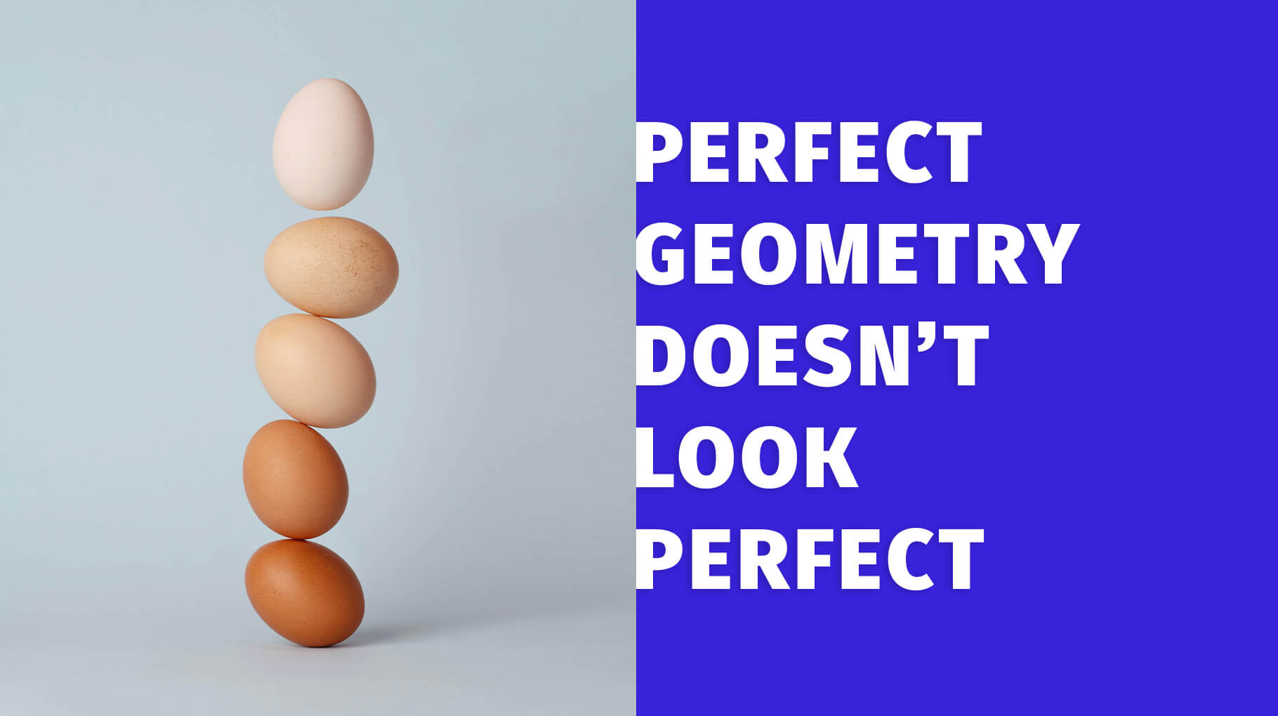
While many designers have the rationalistic urge to push their logos into a rigid modular grid, that is rarely pleasant for our eyes. Because of optical illusions that our brain makes, pure geometry doesn’t look pure. Here optical corrections kick in to compensate. The intensity of correction depends on the context and it is better to train your eye than rely on numbers. Here is the round-up of the most effective tricks. You can apply them easily and bring your logos and other graphics to another level. But only if you are well-paid to go this extra mile! 😉
1. OVERSHOOT
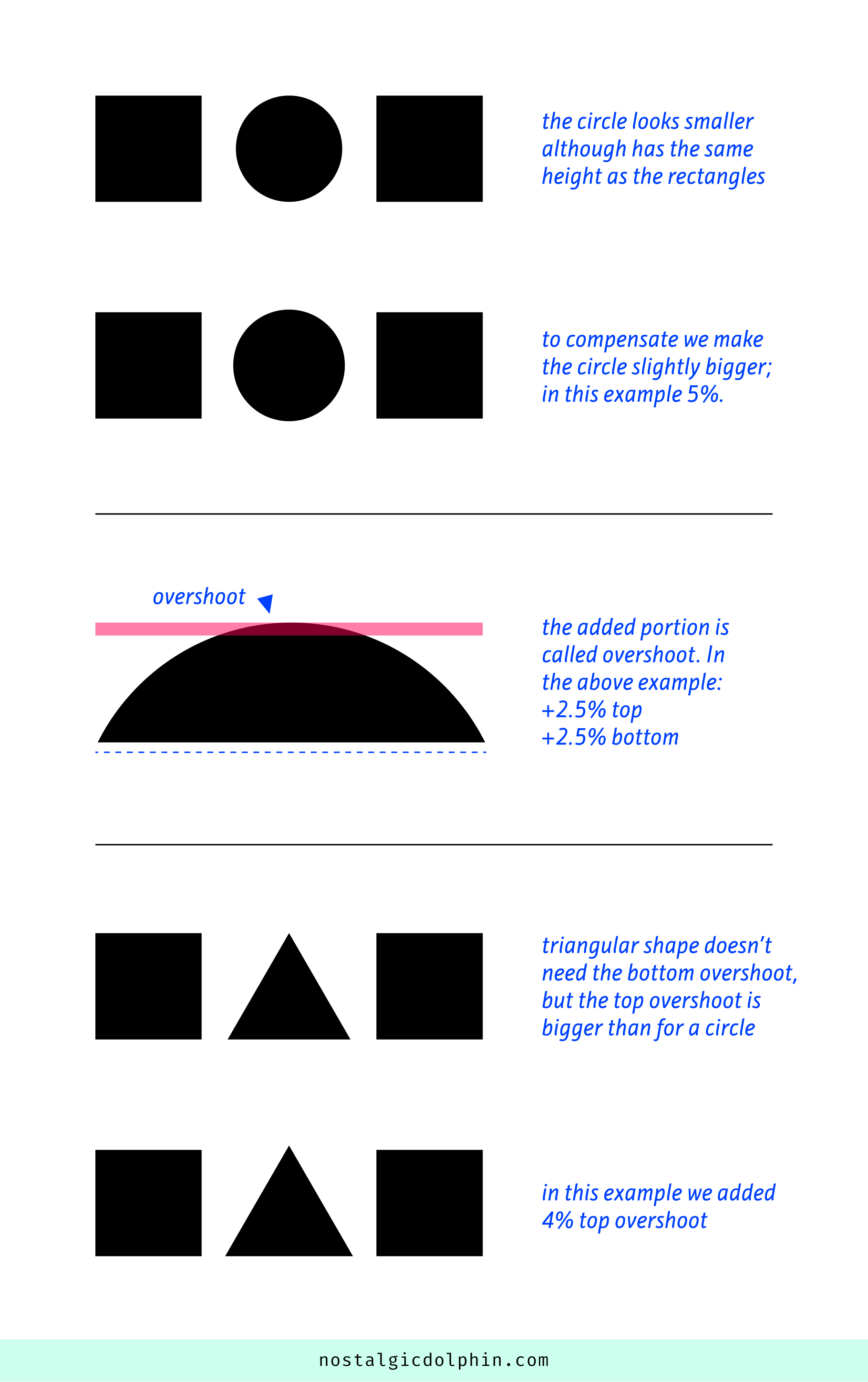
If a circle and rectangle are mathematically the same height, the circle looks smaller. Because the circle has negative space at its top and bottom we have to make it a bit bigger to compensate. The part of the circle that goes beyond the edge of the rectangle is called an overshoot.
We have two of them — at the top and bottom. How big is the overshoot? It depends on the context, but in type design it is usually 1–3% resulting in capital O being 2–6% higher than H (summing both overshoots).
The same principle goes for triangular shapes. We have a solid base, hence there is no overshoot there. But it has a spike at the top which means more white space than for the circle and a bigger overshoot. You can use 5% of the rectangle height as a starting point and then judge by your eye. If the top is cut off (like the top of the A in most fonts) it decreases the overshoot size proportionally.
2. VERTICAL VS HORIZONTAL
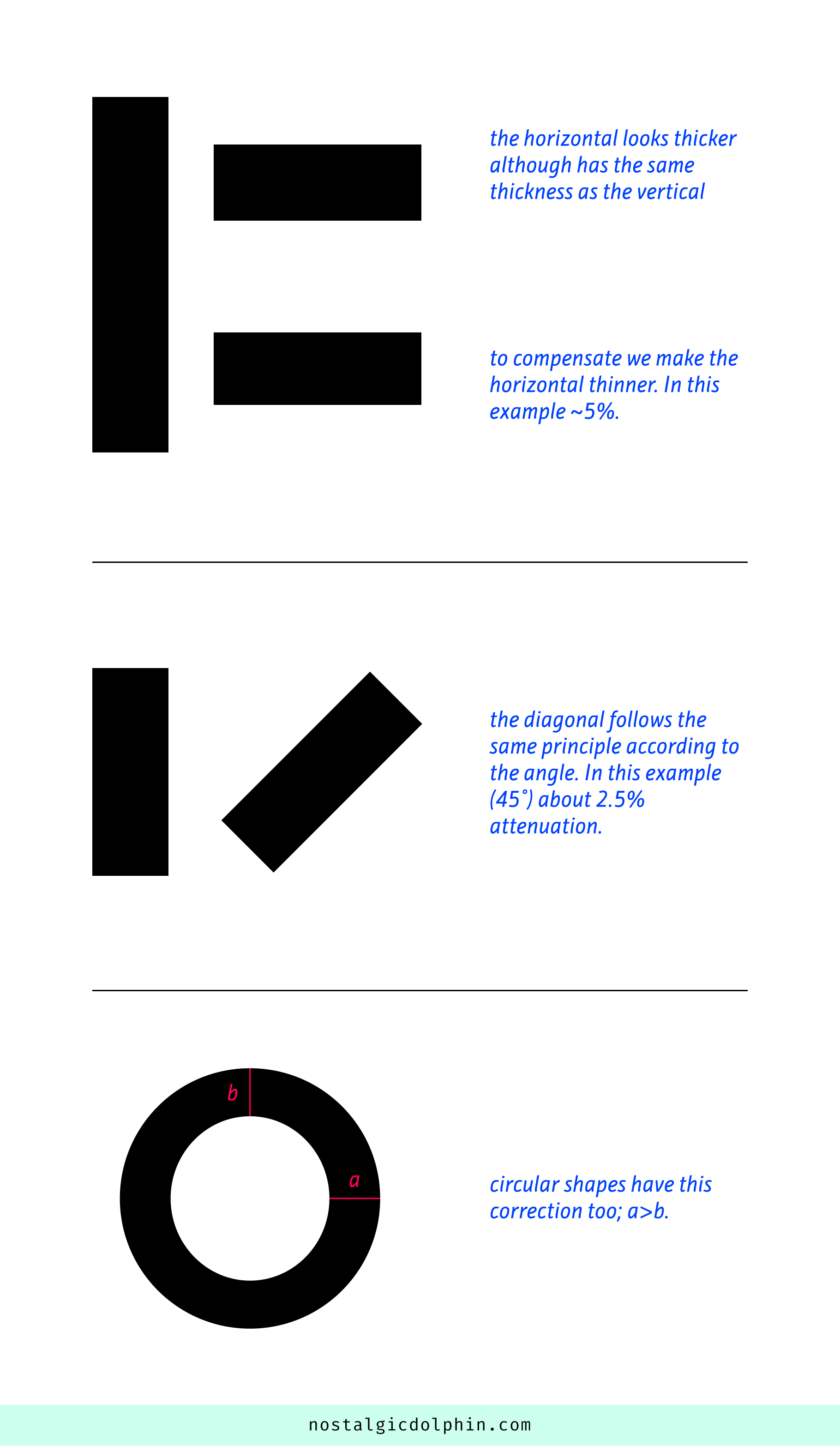
The very same line looks thicker if it is placed horizontally than vertically. To compensate we make horizontal lines a little thinner to make it appear the same. A diagonal line is in between, depending on the angle.
One of the explanations for this peculiar illusion is that through evolution our existence depended much more on the events at our level (horizontal dynamics) than on the inter-level events (vertical dynamics). Hence our eye developed according to this preference. This is especially important in type design because most writing scripts have reading as a horizontal motion, hence the effect is emphasized even more.
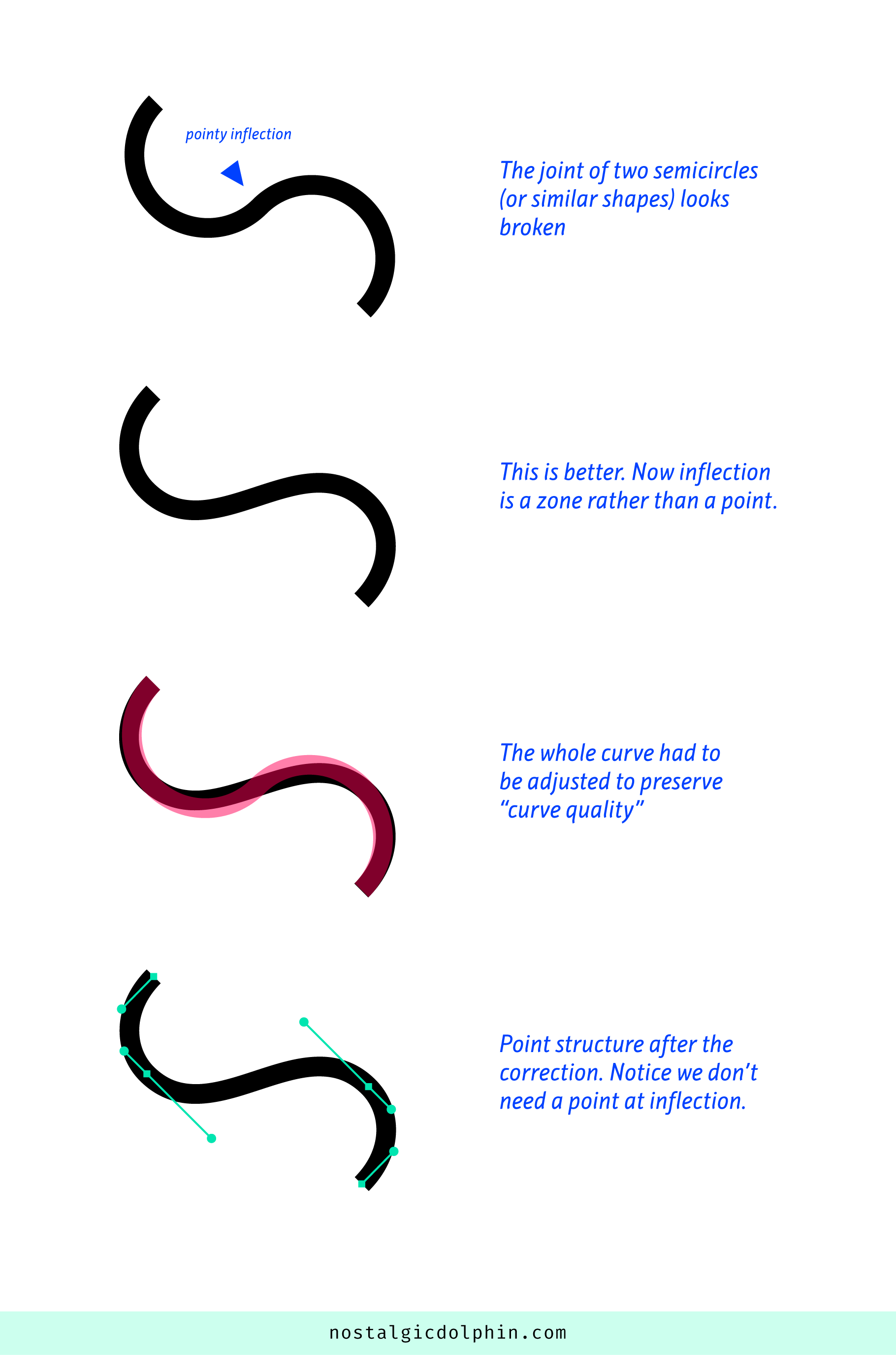
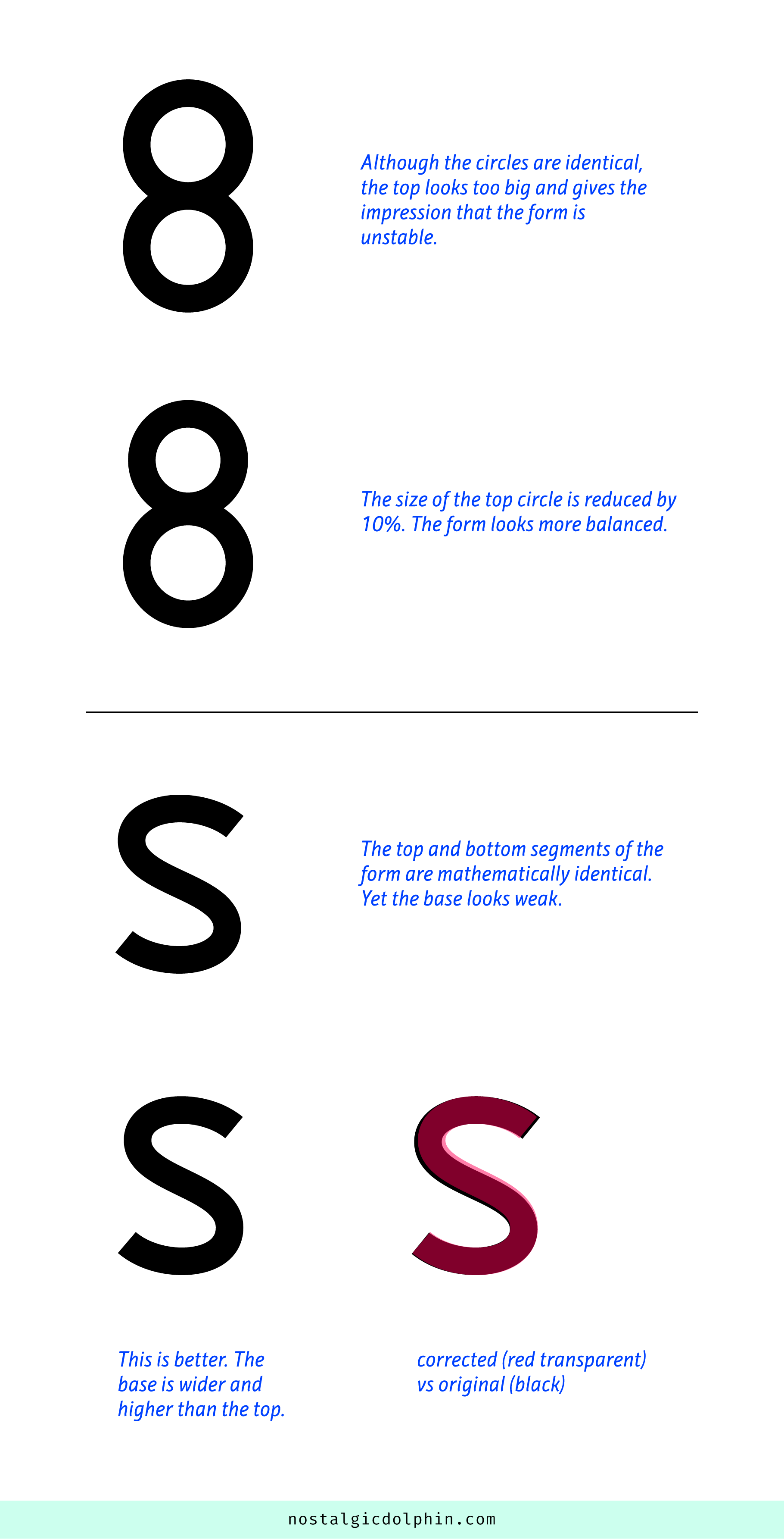
3. BROKEN JOINT OF CURVES
When two semicircles (or curves with similar dynamics) join to form a S-like shape the joint looks broken and should be smoothened. The point where the curves join is called “inflection” and here the motion turns from clockwise to counterclockwise. To remedy the problem we usually have to adjust the whole curve, not just the segments around inflection. Here we deal with the term “curve quality” which describes the perceived smoothness and flow of the curve. This is one more example where “modular” conflicts with “natural”.
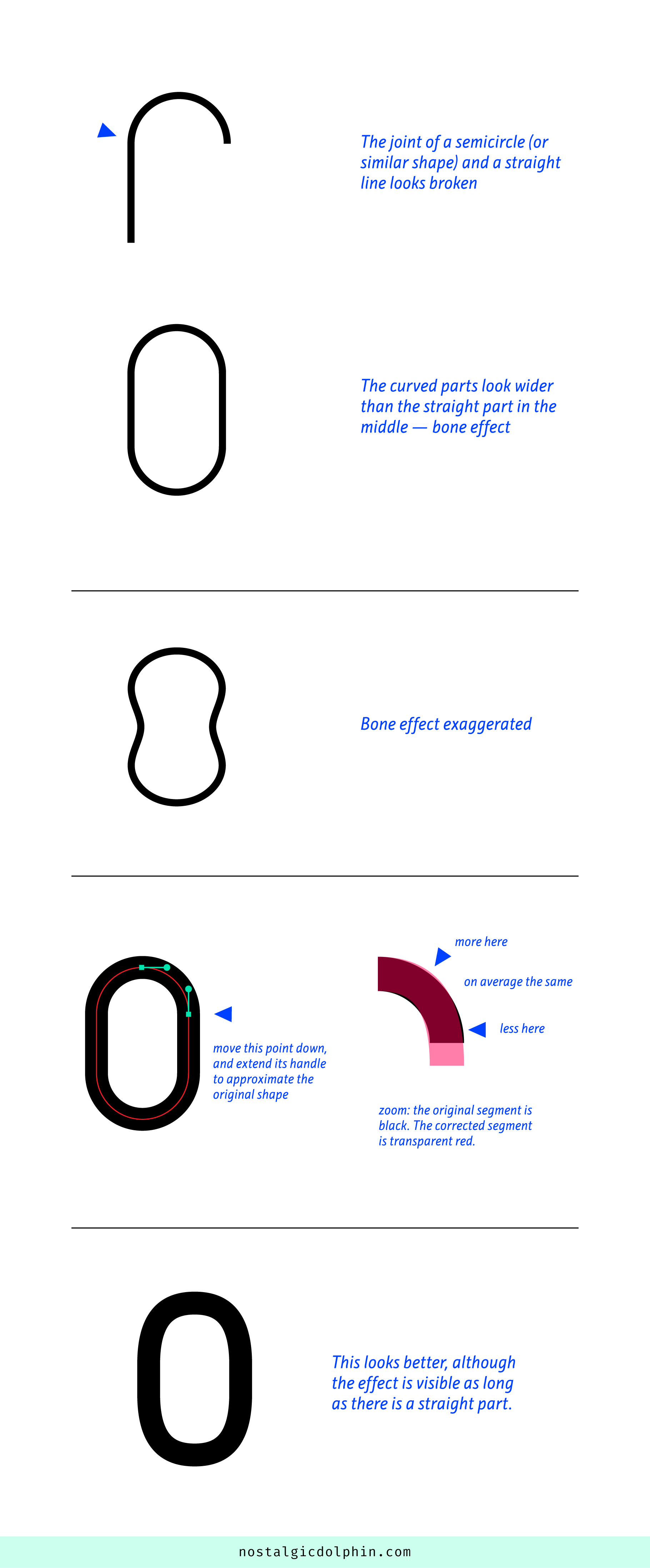
4. BONE EFFECT
When a straight line meets a half-circle, the joint looks spiky. It looks like there is extra mass at the joint. An example is a rectangle with two half circles on top and bottom (O-like shape). The vertical straight part looks narrower than the round “domes”. The whole form starts to look like a bone (look at the example with the effect exaggerated). To soften the turn we move the Bezier points with vertical handles away from the joints but extend their handles.
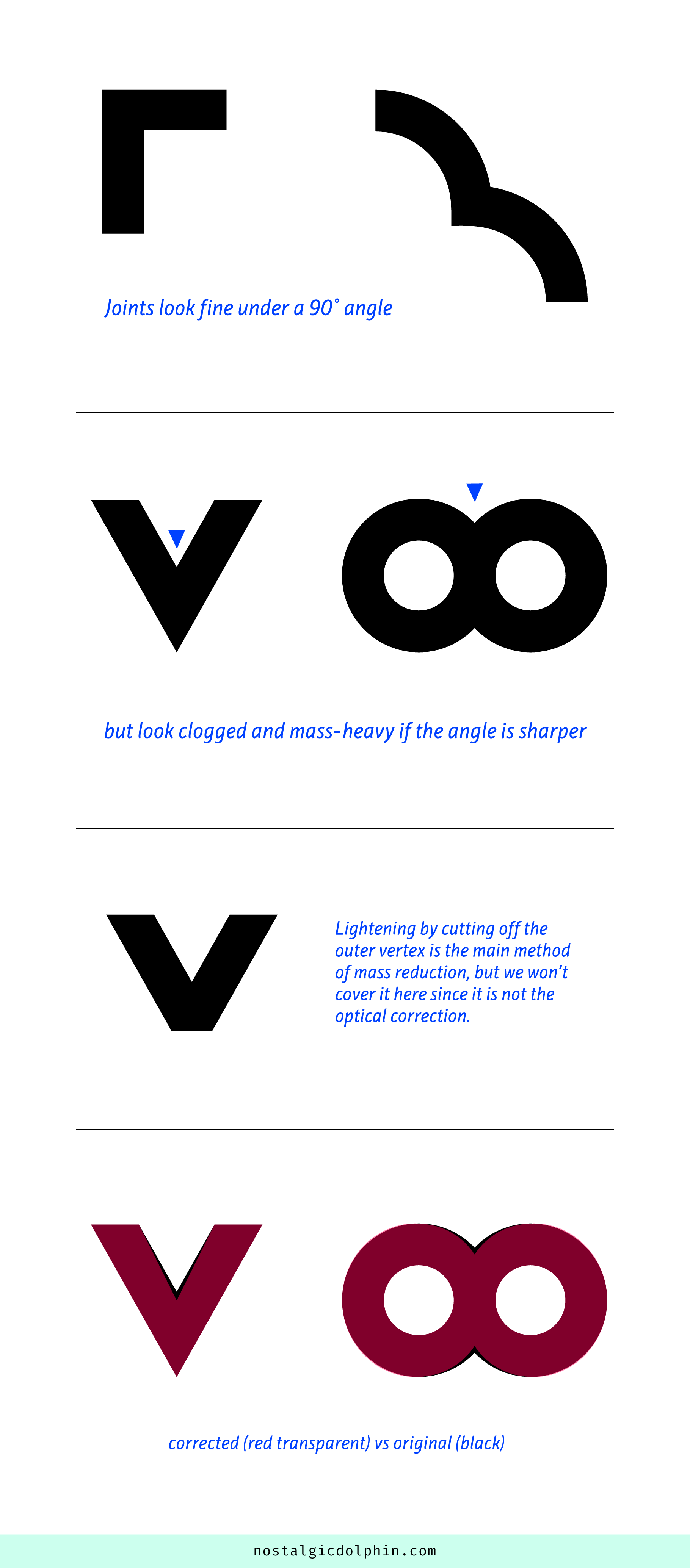
5. SHARP JOINT DARKENING
When two lines (straight or curved) cross at the sharp angle the joint becomes visually heavier and clogged. Sharper the angle — more darkening. The main method to lighten it is to cut off the point’s outer vertex. The intensity, shape and angle of this cut vary and we will not cover it here since it is more of a obvious stylistic choice, rather than an optical correction. Optical correction that interest us is attenuation of incoming rays at the joint. The extreme form of attenuation in type design is called “ink trap” which looks like a corridor of white space cut into the joint mass.
6. BALANCE
The sense of gravity is built in our eyes. That means that when looking at a form we unconsciously expect it to have a bit wider base and narrower top to perceive it as stable. This is one of the main principles in type design. If a form gives impression that will fall over left or right then it should be corrected no matter it is mathematically correct. On the other side, the tension that is made by unbalanced form might be used intentionally in a creative manner. One more reason to understand the notion of balance.
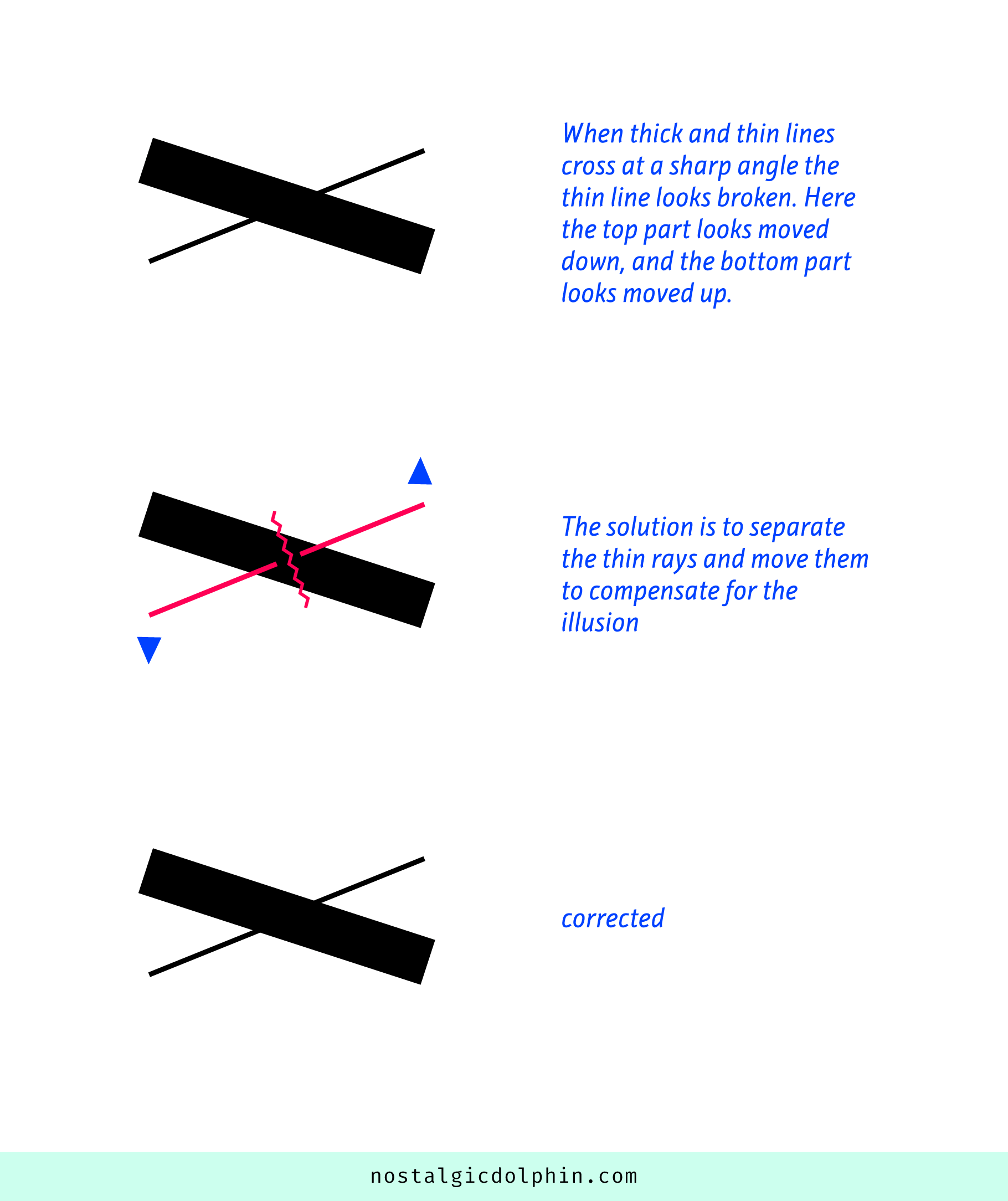
7. CROSS OF THICK AND THIN LINE
When thick and thin lines join at a sharp angle, the thin line looks broken. The solution is to separate the rays of the thin line and slightly space them from each other. This way we make it look like a continuous straight line again. The illusion is more obvious with a sharper angle and more difference in thickness.
A letter X is one of the most known cases in type design. Interestingly, the X social network doesn’t care too much for having uncorrected logo, even if many people pointed out the problem. But we will leave the topic “why contacts are more important than quality” for some other article.