BLOG POST #1
SERBIAN CYRILLIC PART 1 — UPRIGHT
UPDATE: September 25, 2024 — Added Џ (Dzhe) letter
This is PART 1 which covers upright Serbian Cyrillic. PART 2 covers italics, and you can find it on this link:
This article is about how to design Cyrillic letters Њ, Љ, Ђ, Ћ, and Џ. They are often problematic since they are Cyrillic, but not found in the Russian alphabet, so there are not many references and guides on how they actually should look. Њ, Љ, and Џ are used in Serbian and Macedonian, while Ђ and Ћ only in Serbian. Here is my research and opinion as a native Serbian speaker/reader.
Please take this as an opinion rather than a hard rule. The article tries to find out what is the default. These characters could be a subject of creative experimentation, like any other character in the typeface. The idea is to establish a solid starting point, not to limit creative freedom.
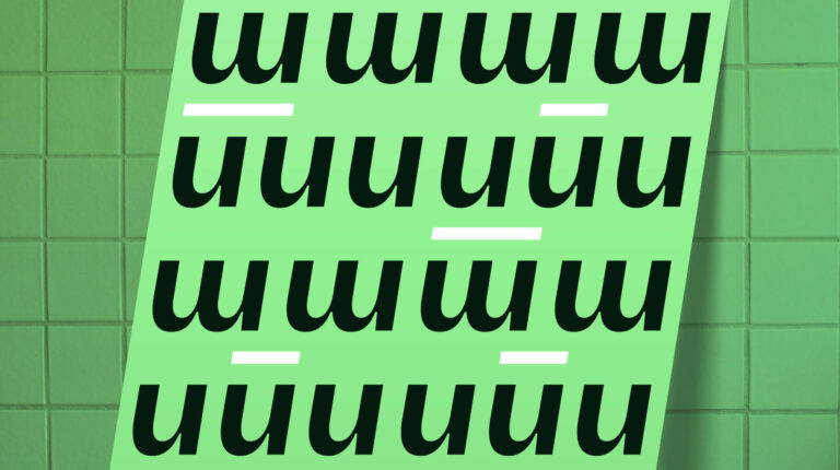
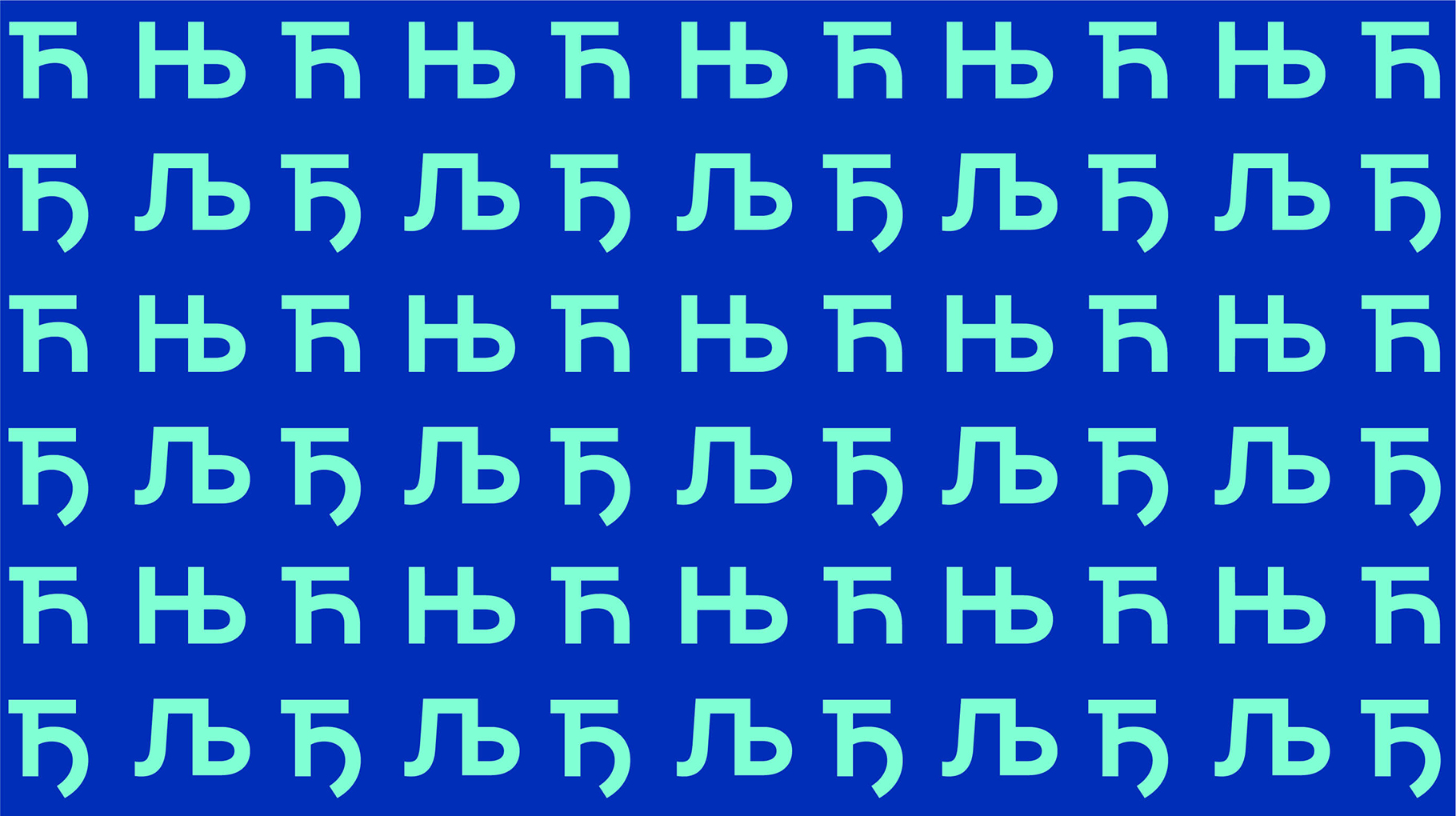
Њ — Nje — (Capital U+040A, Lowercase U+045A)
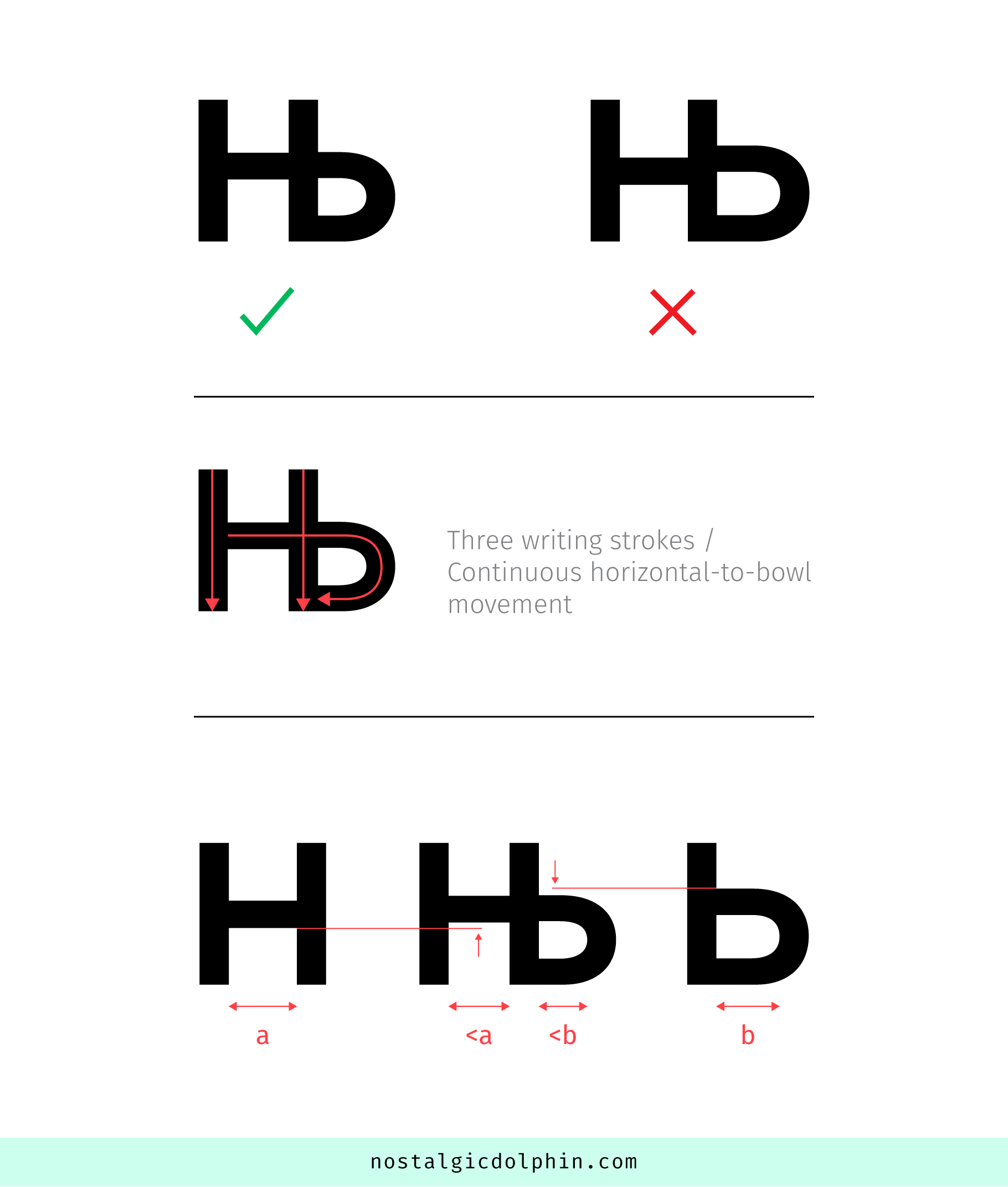
The first, and probably most often wrongly designed is Њ. It’s the soft variant of the classic N, and sounds like the N in “New”, compared to the classic N in “Now”. Latin counterpart would be Spanish Ñ. The look of the glyph was invented by Vuk Stefanović Karadžić, turning Cyrillic N (looks like Latin H) and Russian soft sign Ь into one ligature glyph. But over time the perception of the grapheme evolved, so it is considered as a separate glyph, not as a ligature. Writing movement using three strokes also suggests it’s a glyph per se. This fact influences the design of Њ.
The first step is to make the H and Ь parts a bit narrower, to avoid Њ looking too wide. The second — and the most important thing here — is to ensure that the horizontal bar of the H part and upper part of Ь bowl look like a continuous line. Often — even in high-quality professional typefaces — this is not the case. A simple morph of H and Ь, in the vast majority of cases, will not do the job, since the bowl of Ь is usually significantly higher than the H bar.
To remedy this, the H bar goes a little bit up, and the upper part of Ь bowl goes a little bit down. The goal here is to make them “appear” as a continuous line, but in fact, they will probably still be slightly misaligned to soften the change and keep them looking as similar as possible to the original H and Ь. Also, the H bar is usually a bit thicker than the top horizontal of Ь bowl, and you can keep this small difference.
Speaking of bar/bowl stroke thickness, maybe it is a good idea to make Њ bar slightly thinner than the H bar, and the top bowl horizontal of Њ slightly thinner than in Ь, especially in heavier font weights, to avoid the congestion of black at this “4-ray” crossing.
A good thing while designing Cyrillic is that lowercase (for upright) is basically a small cap most of the time, so the lowercase њ follows the logic.
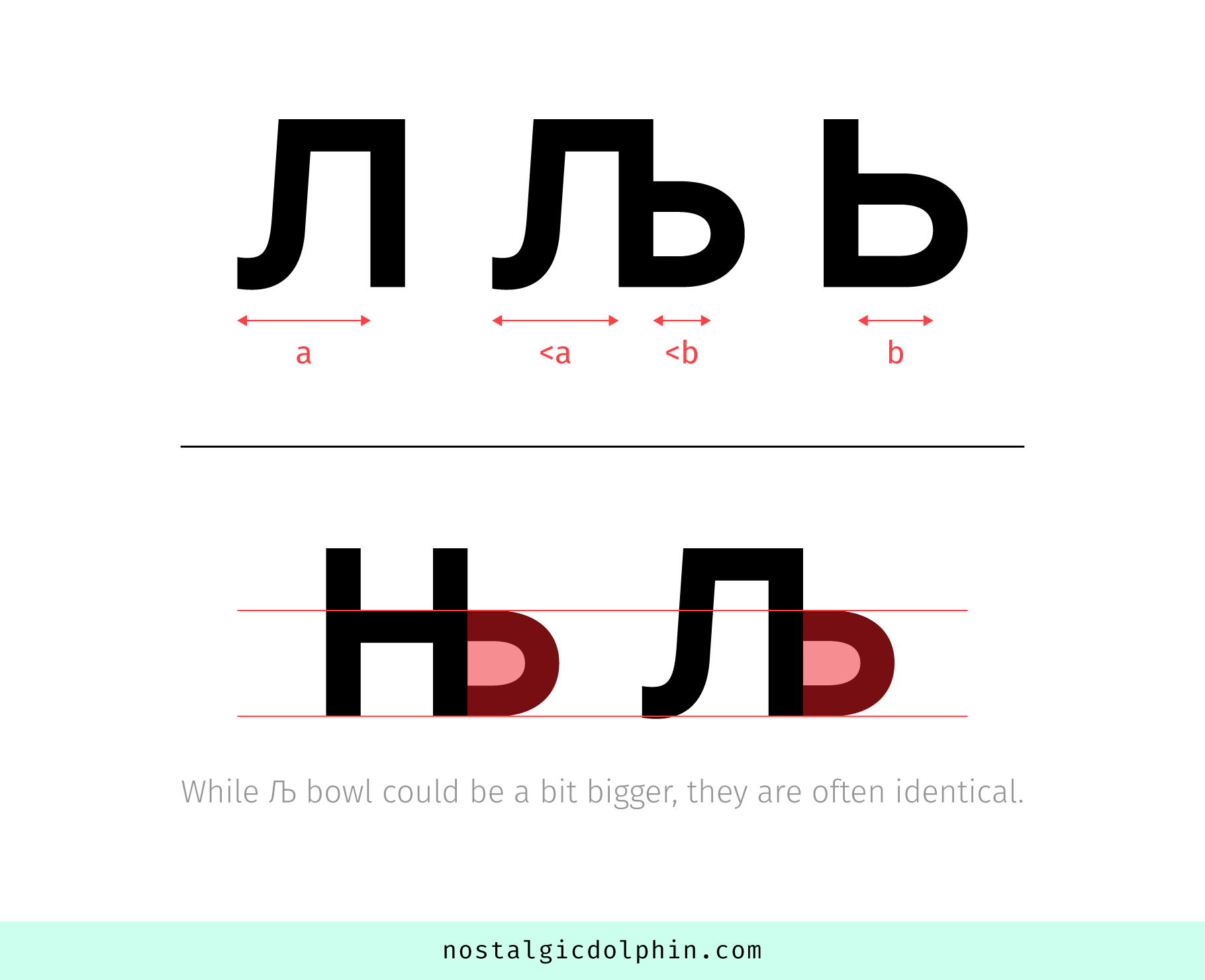
Љ — Lje — (Capital U+0409, Lowercase U+0459)
Љ is softened L. It’s a bit hard to find an example of the sound in English, but there is a lot of it in Spanish in the form of double L (for example the word “caballero”). Following the logic of Њ, the origin of the grapheme is composite, adding the soft sign Ь to the Cyrillic letter Л (L), but again it’s rather considered as a character by itself than a ligature.
Both Л and Ь parts are a bit narrowed. As for the bowl, here we don’t have the constraint of the horizontal bar (as we had with Њ) but still want to keep these two consistent. That said, it’s usually the same as on Њ, but it’s ok to go a bit higher (sometimes also a bit wider) than that. Anyway, it’s most often closer to the Њ than Ь bowl. The lowercase is a small-cap again.
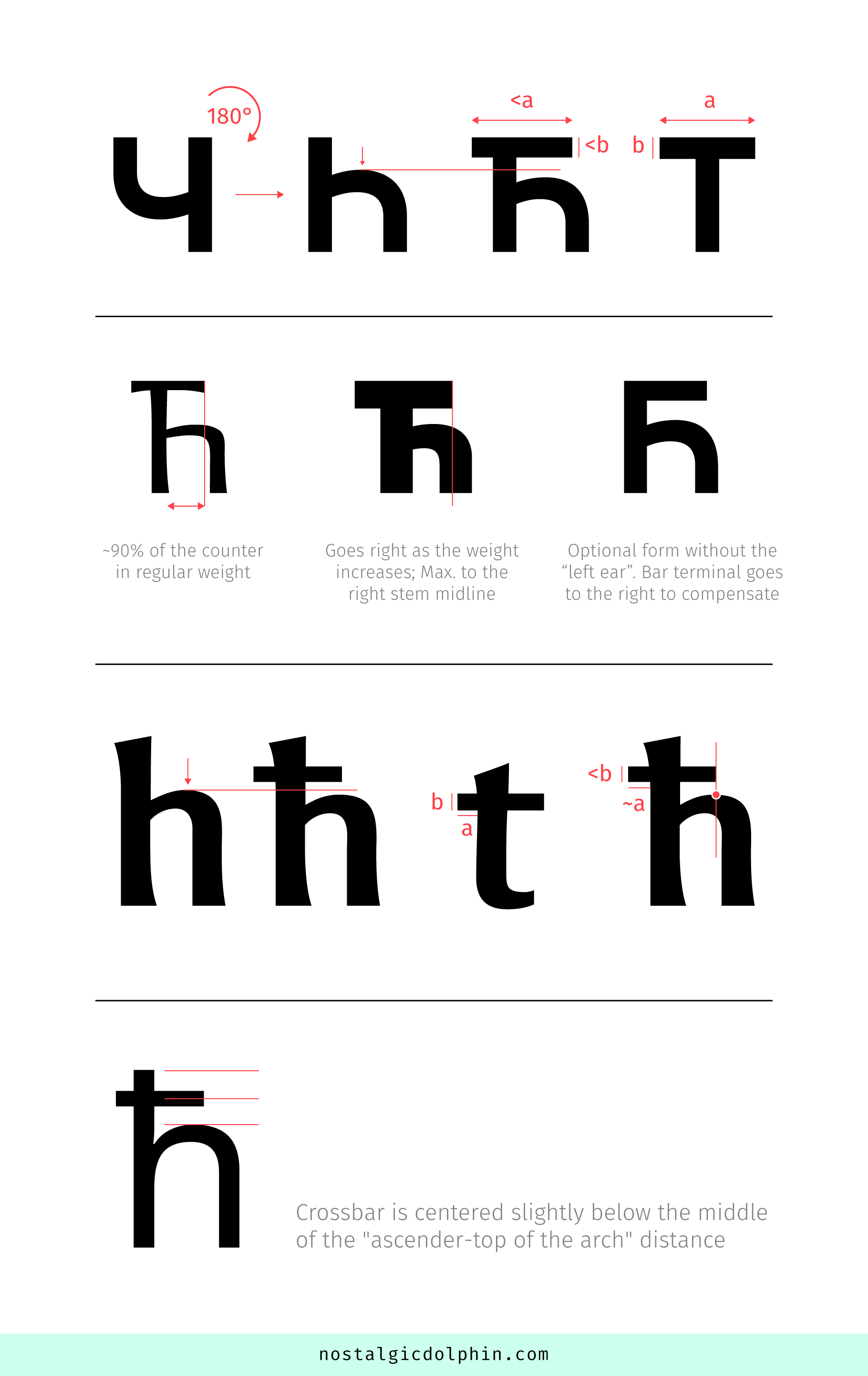
Ћ — Tshe — (Capital U+040B, Lowercase U+045B)
The last letter of many Serbian last names, like “Djoković”, i.e. Sounds like “ch” in the Spanish word “muchacho”.
The glyph is based on Cyrillic Ч rotated for 180 degrees. Because we have a horizontal bar (at the top), the arch tends to go a bit lower — especially in heavier font weights. Often, the counter is also a bit narrower, but the change in this direction is smaller than that in a vertical direction.
The top bar is most often a bit narrower than that on T, and it’s moved to the right. As a starting point in regular font weight, you can place the right bar terminal at about 90% of the counter width (it can go a bit left and right from that). In heavier weights — as the counter shrinks — the right bar terminal falls more toward the right stem, but not beyond the middle line of the stem width (approximately). The placement of the bar left terminal also varies, but it’s placed so the bar is narrower than the T bar, and not too much to the left to avoid spacing problems. The bar could be a bit thinner if needed, to keep enough amount of white space between the bar and arch.
There is a variant of the Ћ without part of the bar on the left side. It can be often seen in informal handwriting, but it’s relatively rare in type design. The advantage of this variant is the better spacing on the left side, while the disadvantage is a more problematic bar-arch relation (because the bar now has to go further to the right to balance the absence of the left part portion, which closes this tight space additionally). But if there is enough space, I would personally like to see it more often. I would say it’s more convenient for modern/geometry/eclectic typefaces.
Lowercase ћ is actually h with the crossing bar. Most often in the regular weight, it has the arch identical to the h, but I think that slight lowering is ok if needed, because usually, we have even less space between the bar and arch than for caps. However, the amount of lowering should be inside the range of optical correction, and should not compromise x-height alignment too much. This lowering is usually needed as the font weight increases, anyway.
The bar is very similar to that found on crossed d (đ, U+0111), which means it’s probably a bit thinner than the t bar (more obvious at low-contrast typefaces). On the right side, it’s aligned somewhere near the top node of the arch. On the left side, it extends similarly to t. Its vertical position is centered slightly below the middle of the “ascender – top of the arch” distance (again having enough bar-arch distance is very important, and it’s often too tight in the existing typefaces).
Ђ — Dje — (Capital U+0402, Lowercase U+0452)
The first sound of the surname “Djoković” i.e. Sounds somewhat like the first sound in the word “Jaw”.
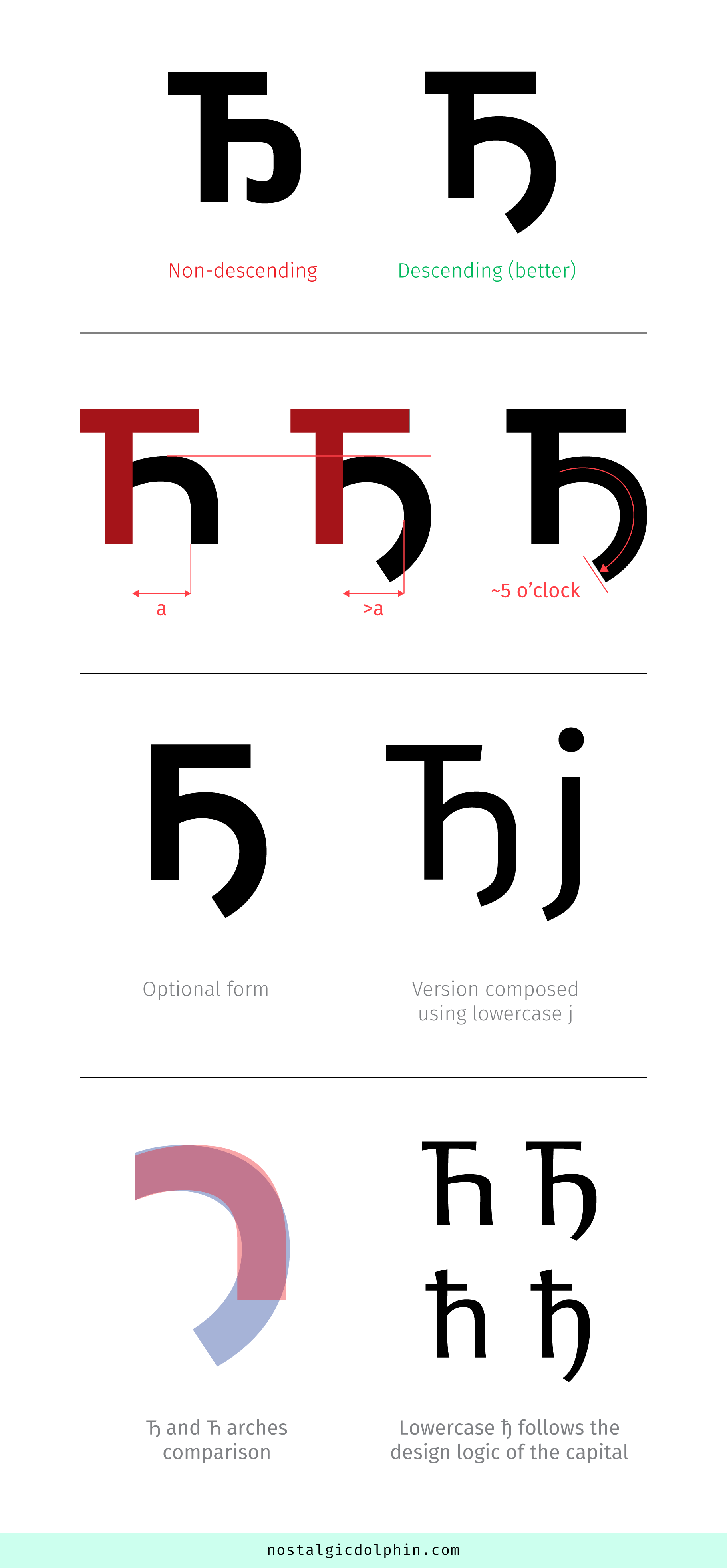
You can start from Ћ editing the right stem. There are two main variants of capital Ђ: “descending” and “not descending”. Both are accepted and used, but I am really not a fan of the “not descending” since it curls into the bowl at the baseline, being too close to capital Б and not different enough from Ћ. Especially in the case where we already have a widely accepted descending variant.
This second form I prefer has a descending tail growing from the arch. Depending on the font style it can hit the descender line or can be a bit above it. Sometimes it is in the form of simply added “j” part to the right stem. This gives the glyph a “DIN-ish” look which works well for rational/geometry fonts, but not so well for humanists or typefaces that tend to have a warmer voice.
The more “organic” variant requires the right stem to morph into the bowl (probably removing the straight vertical part completely), building a single curved stroke with the top arch. The angle of the curve usually stops somewhere at 5 o’clock (this relates to the stroke curvature only, not the shape of the terminal which can be cut as in the rest of the typeface). This change sometimes keeps the shoulder of the top arch the same, but sometimes it is “softened” to relax the tension of the curved stroke. Also, if needed this bowl can be a bit wider than the Ћ counter, to accommodate the curve (if the tail descends fully). The top of this bowl could go a bit lower than the top of the Ћ arch if needed.
If Ћ is designed without the left portion of the horizontal bar on the top, Ђ should follow the same principle. In that case — when there is no “left ear” — you would like to make sure that the aperture (whose descending part forms with the left stem) is open enough to avoid looking too close to Б (Latin B) which also has no “left ear”.
Lowercase ђ follows the same logic, starting from lowercase ћ.
Џ — Dzhe — (Capital U+040F, Lowercase U+045F)
It sounds like “j” in the English word “jump”. It originates from Romanian Cyrillic (Romanians use Latin script today) in the 15. century. Gavril Stefanović Venclović brought it to Serbian Cyrillic in the 17. century.
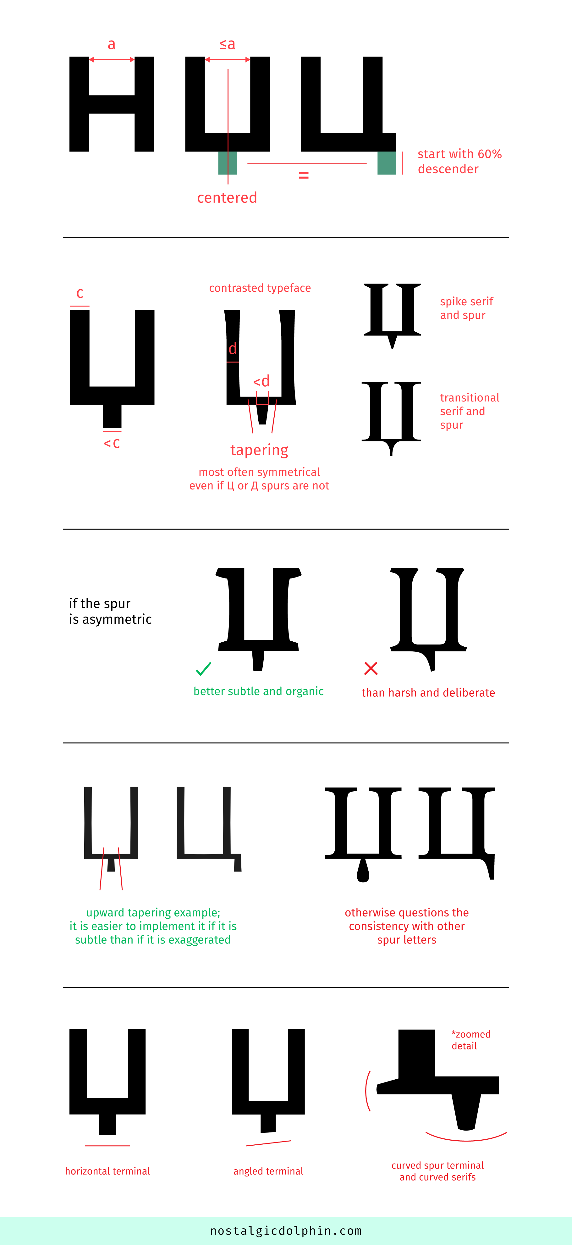
The width of capital is like H. Maybe slightly less than that if you are a proponent of the theory that H should be a bit wider because its counter looks somewhat smaller being split in half. The descending spur is horizontally centered and the same size as the Ц spur. That is usually somewhat shorter than the descender, but if the typeface descender is tight it can even take full descender. 60% is a good start for an average descender size, and then see if it is well pronounced at a small size. Better to make it a bit bigger than a bit smaller. Example Resavska: descender -236 / Џ (Dzhe) spur bottom extremum -140 / @1000 UPM.
For low-contrast typefaces, the spur width is slightly thinner than the stem but not too much (to compensate for being a much shorter stroke; the difference is more pronounced in bolder styles). For contrasted typefaces, the spur usually tapers (from top to bottom). The thick end is thinner than the vertical stem (the difference could be more obvious than for low contrast). Tapering intensity and shape reflect the general contrast of the typeface and the look of serifs. For example, the Spectral typeface has spur tapered to the spike to follow the look of its serifs.
While spurs for Д and Ц could be asymmetrical, Џ spur is most often symmetrical. Where it is not because of stylistic reasons (humanist typefaces), subtle and organic asymmetry works better than harsh and deliberate.
Rarely, spur tapers from bottom to top. This is an interesting solution because it lightens the joint but also questions the look of spurs on Џ Д Ц Щ and their relation. This is easier to implement consistently if the tapering is subtle.
The bottom spur terminal is a stylistic decision. It is usually cut horizontally, but there are examples of angled (humanistic typefaces where extended stems like p or d are cut that way) or curved endings (typefaces with curved serifs).
Lowercase is a small cap.
In the images, I have used my font NASLOF and these great fonts from other type designers:
RESAVSKA, ADAMANT, NOTO SANS, FIRA SANS, SPECTRAL, NEOPLANTA, OBLA, SKOLA SANS, GABRIELA, STIX TWO TEXT, LAPIDARY CAPITALS.