BLOG POST #2
LOGO DESIGN INSIGHTS — PART 1
Across the web, many articles provide a solid understanding of basic logo theory. However, they often cover a similar, well-known area that forms a professional commonplace. Here at Nostalgic Dolphin Studio — working on numerous logo design projects over the years — we noticed some tendencies we hadn’t found in theory resources elsewhere. Some other insights are not new, but we feel they are not generally emphasized according to their importance.
The idea is to round up them here in a few easy-to-digest blog posts. Sometimes, these findings complement the existing postulates, but at other times challenge widely accepted practices and beliefs. The main goal is to critically rethink the matter and widen the area of creative freedom instead of trying to build counter-dogmas based on personal opinion.
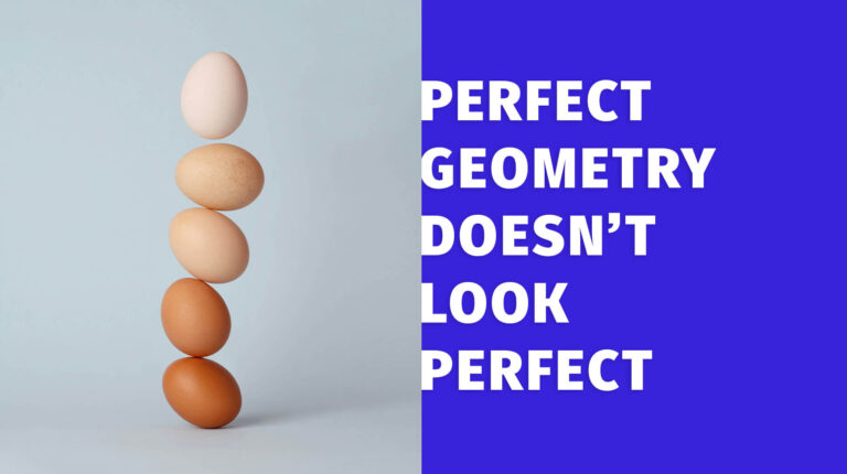
1 — “SIMPLE” AND “ORIGINAL” ARE OPPOSITE FORCES
While there might be lucky exceptions, an idea that is too basic usually means higher chances that other people used it before, so it’s less original. If it’s too simple, the idea becomes commonplace, which is the purpose of an icon and exactly the opposite of what we want from a logo. Take a plain green circle as an example. It’s very simple, but it’s not enough to be called a good logo. Add a checkmark to that — now it’s an icon.
Hence we want to move away from “too simple” toward more complicated/original. However, going too far in that direction might make it original, but not memorable (and to be memorable is the main goal of a good logo). Think of QR codes, for example. Each of them is absolutely original, but the code itself is complicated to the point where all of them appear to be the same. Only a computer can recognize it.
The trick is to find the sweet spot between simple and original, which is the core of the logo design process. This sweet spot should fall and work in the range of cognitive environments in which the logo appears. Imagine a shelve full of similar products by different vendors in the supermarket, a TV commercial, a web banner, or a billboard by the highway. In all of these cases, a good logo should be recognized and memorized in a split of second.
2 — GENERIC NAMES ARE HARDER FOR DESIGN
It is easier to design a logo for a company named “Blue Hat Turtle” than for “Inspire the World” (I didn’t google any of these).
Clients usually come with a predefined name and that’s beyond the control of the logo designer. However, the company name is crucial for successful branding. If the name is too general/common, all the originality is left to the graphic aspect and that could be burdensome. Overused words sound, look, and mean overused, and we can’t rely solely on them (wordmark) or make subtle graphical moves (for example, just exclude a horizontal bar from the capital A). In that case, it would probably need a stronger graphical symbol or a much more original typography choice or layout.
As an example, imagine a client with a generic name — something along the lines of PEOPLE or WORLD or NEW + LOVE or BEST or QUALITY. These words bring overused icon symbols to mind (avatar, globe, heart, checkmark, star). It is not easy to devise a good fresh concept out of them. You can still make a great logo but it’s harder since you go away from the primary visual lead instead of following it.
One way is to go abstract based on the keywords (since generic names are essentially just keywords). But abstract design is a more delicate ground if it aspires to move away from the overused abstract or half-abstract cliches. There are no fixed relations between shapes, their visual effects, and the meaning/emotions so it requires a stronger sense, longer research, and more decisions.
A logo doesn’t have to be logical or rational, and often it’s great if not. So another option is to have an obvious symbol next to a generic unrelated name. Speaking of our example — the turtle with a blue hat next to the “Inspire the World” name. But it’s not easy to convince the client to make such a surprising twist — why a turtle, why a blue hat, etc. If their company name was “Blue Hat Turtle” then the graphic part would be more straightforward. Also, having an “out of the blue” or paradoxical symbol (“Purple Cow” theory) is the statement and that strategy doesn’t work for all brands and niches.
When it is an option it should be well articulated and contextually appropriate. Even though the symbol is irrational it should work well with the name and they should convey the same voice. As with abstract, these visual and narrative relations are more hidden and it requires advanced skills to judge the result. Although there are some known principles, even experienced designers have no exact analytical criteria, but rely on their intuition that “this fits better than that”. Otherwise, because of the big discrepancy between the visual solution and the company name in terms of specificity, a logo might look odd, whatever, or misleading.
Aside from name originality, some letter combinations are simply visually more convenient for manipulation and have more graphical potential than others. For example, the word “IMOXOMI”. Symmetric, with shapes optimal for best spacing, has a central X — something you can start with (not necessarily, though).
3 — TYPEFACE CHOICE COULD BE 80% (IF NOT 100%)
A typeface is already graphic design per se. So if the company name is chosen wisely, combining it with an original, appropriate, and well-designed typeface can make a conceptually finished logo without the need for a graphic symbol. This type of logo is called a wordmark. I wrote “conceptually” because type designers are rarely able to make a particular letter combination perfect, so some further typography treatment is usually needed — fine adjustments of spacing or letterforms. It can work in this pure form (Sony), have a subtle graphic stylization (Samsung), or work with simple additional graphics that build a micro-story (Amazon).
Typefaces are divided into two main categories: TEXT and DISPLAY. Text fonts are used for small-size running text and their design is heavily restrained by their purpose. On the other side, display fonts bring more personality and originality (at the expense of functionality at a smaller size and in running text) which makes them ideal for logo design.
MULTICOLOR fonts might be labeled as “ultra-display” because of their rich visual character. They are not overused as a branding concept and might be a fresh and interesting choice because of their distinctiveness. On our FONTS PAGE you can find a few multicolor fonts we designed with this purpose in mind. Instead of using existing fonts, some companies decide to hire a type designer to create their exclusive typeface as a part of their brand. There are a few reasons and benefits why this might be a good move for some businesses.
Lastly, a brief observation. When it comes to a wordmark, it might seem less work in the client’s eyes — “I could also type some text and call it a logo.” That issue requires a smooth way to communicate, but the designer in the first place shouldn’t feel like an imposter here. We are not paid only for raw labor but for our experience, knowledge, and opinion. The goal is to make the best decisions for the brand, not to justify the price only by hard-working hours. Not to mention that browsing through the font base, taking screenshots of samples on font stores, trying different case options, layouts, etc. could take even more time than designing a symbol.